Joyplux Technologies - 2020
# UX Research
# UX Writing
# Html/Css
# Usability
# Kiosk
My Role
UI Designer/UX Researcher
Deliverables
User Research, UI Design, Basic Html & CSS, Multivariate Testing, Design Guideline
Duration
Nov 2020 - Dec 2020
Overview
Restaurants using our self-ordering kiosks weren’t seeing faster order times. Customers often lingered or asked staff to confirm their orders. We suspected the issue was unclear UX writing in the menu interface, especially with the many customisation options common in Taiwanese cuisine.
The Background
Our Goal
Provide customised e-menu and interfaces for self-ordering kiosks in restaurants to speed up the ordering process.
The Context
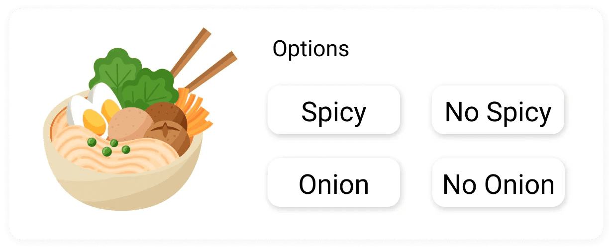
Taiwanese restaurants tend to offer highly personalised dishes with lots of extra options for flavours, portions, or add-ons, so the UI of the menu is crucial.
Research Process
Discover & Define
Understanding the Problem
💬 Semi-structured interview with the Clients (Restaurant Owners)
Through contextual semi-structured interviews, we noticed that our clients (restaurant owners) were not satisfied with the effect of self-ordering kiosks.
“Customers would take a lot of time pondering in front of the kiosk.”
“They still ask us to confirm after using the kiosk.”
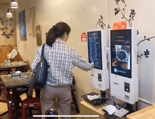
👀 Fly-on-the-wall Observation of the End Users (Customers)
Observing real users confirmed the interview findings: many hesitated over how to customise dishes.
🤕
Pain Points
End users having trouble understanding the options.
Evaluate the Problems
📌️ Why This Mattered
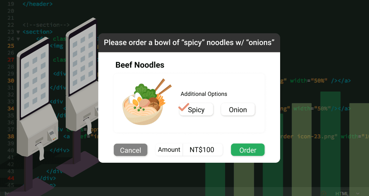
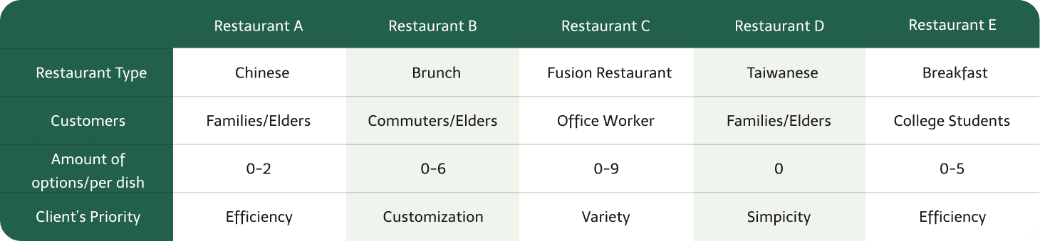
For the top 5 client restaurants, nearly every dish had multiple options (e.g., spice level, toppings). Poor UX writing in these flows led to slower decisions and ordering errors, which created bottlenecks and customer confusion.
🔬 Investigating the Current Design
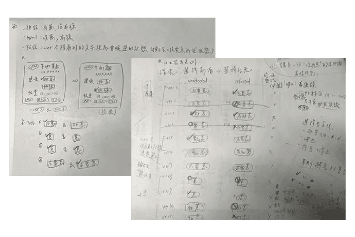
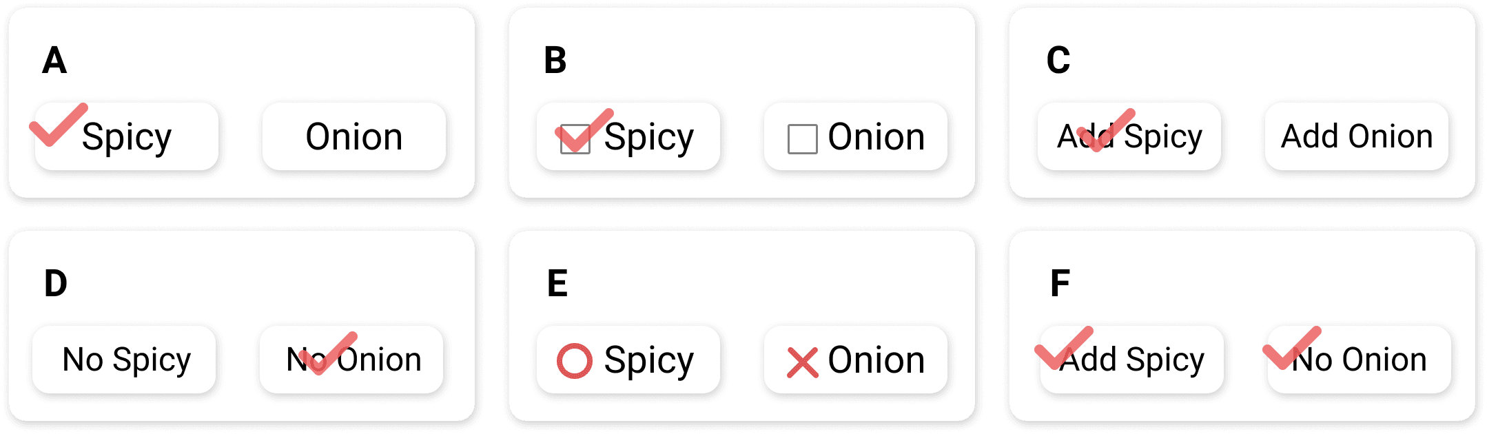
I reviewed 11 variants of option wording in Mandarin. Ambiguities like “不要辣” (no spicy) paired with unclear icons or labels often contradicted user mental models. Common confusion points included:
Double negatives (“Not adding” + a cancel icon)
Symbols contradicting text
Unclear states of selection
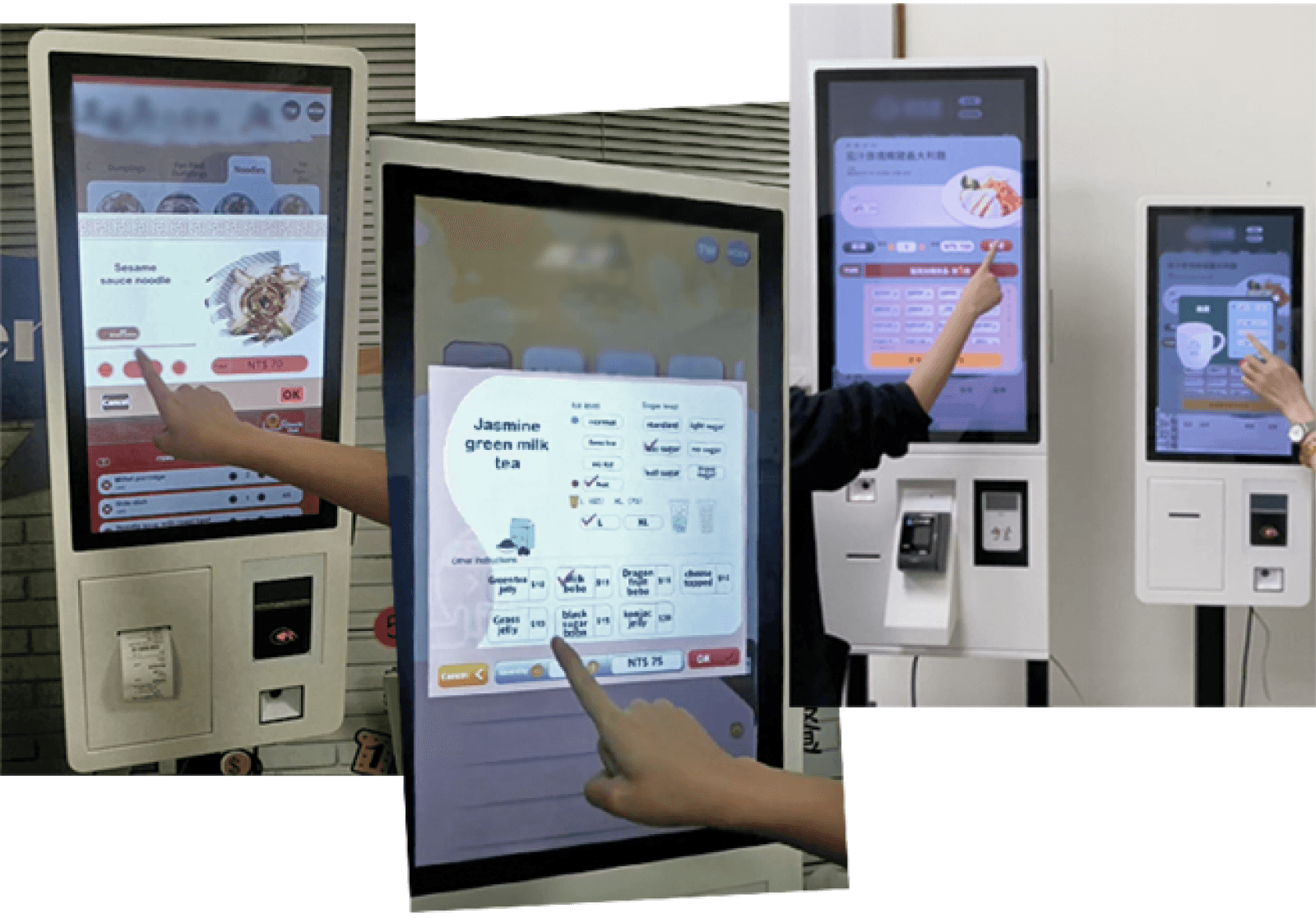
Testing
Usability Testing
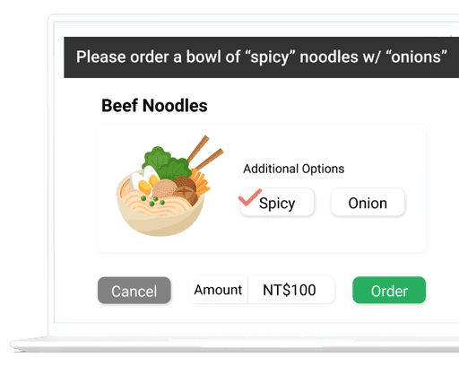
Internal usability testing is conducted to compare the usability of different designs. Participants were asked to order several different designs. We could discover the problems by observing their actions and emotions through the process and collecting their opinions afterwards.
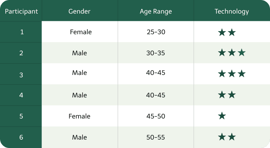
We recruited colleagues from other departments that are less familiar with the system for user testing. Participants of different genders, ages and technology familiarities were included.
The Results
Confusing designs were decided to be excluded after testing.
6 variants groups were chosen for the further multivariate testing.
Our Hypothesis
If we change the UX writing and symbols of options, it would improve order speed and accuracy.
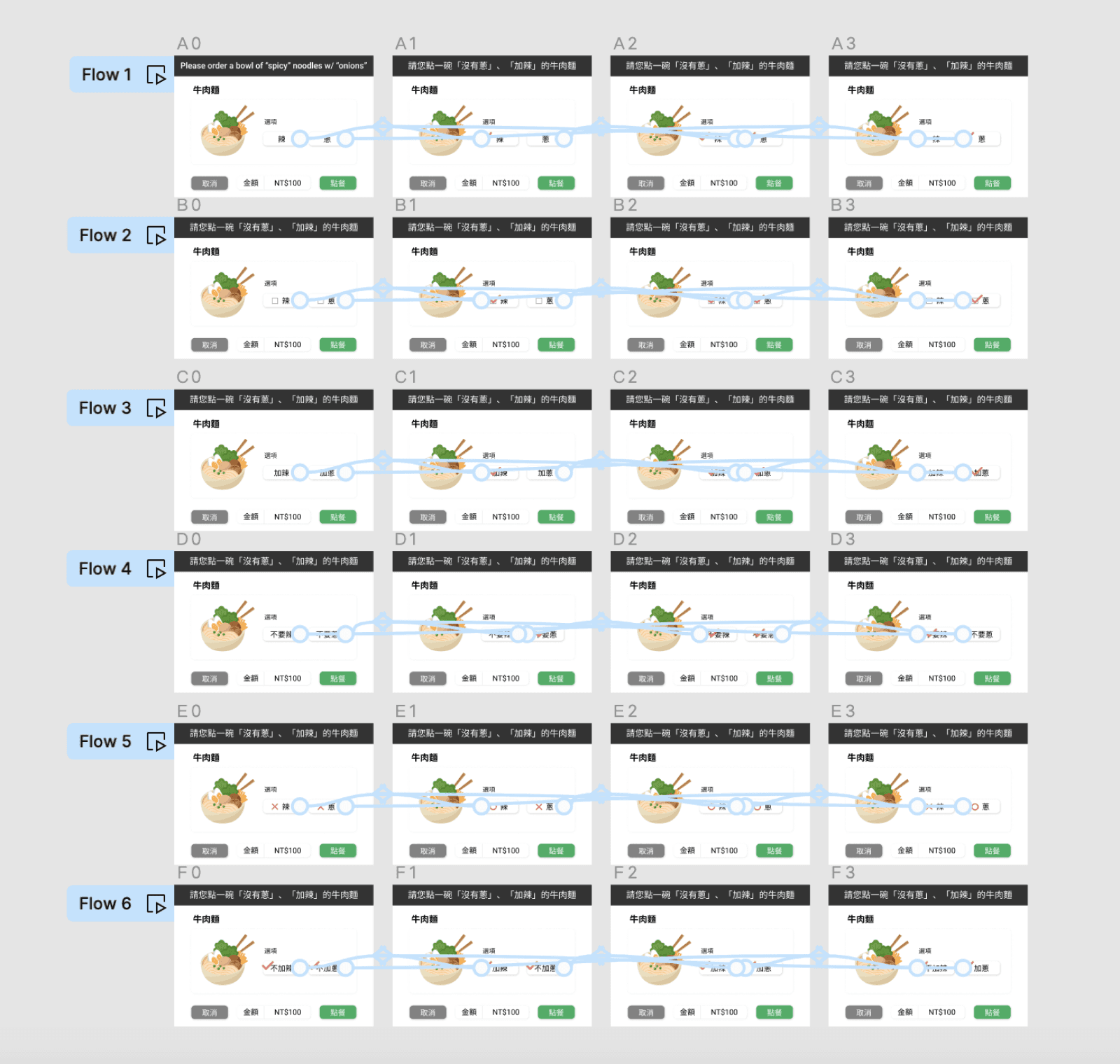
Multivariate Test
With a hypothesis and several design options in debate, multivariate testing turned out to be an appropriate method. Google Analytics was used to track users’ activities and flows on the testing sites, while Google Optimize was used to redirect and analyse traffic and the task completion rate.
🎯 The Objective
To find out the most intuitive button design and UX writing that aligns with the majority of users’ mental models.
🚧 The Limitations
We had limited resources, such as lacking available web domains and front-end web developers to build the experimental websites.
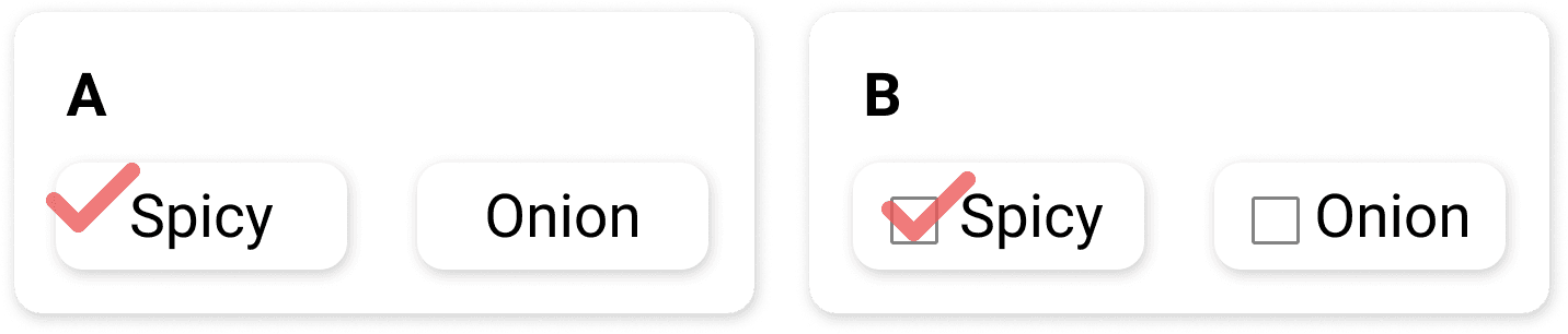
The Variants
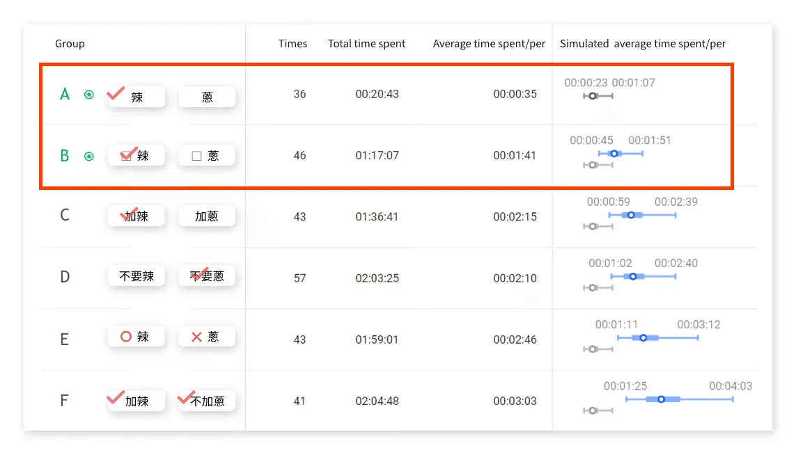
The number of variant groups was filtered to 6 after previous testing. Except for the buttons, all other designs were the same.
Outcome & Impact
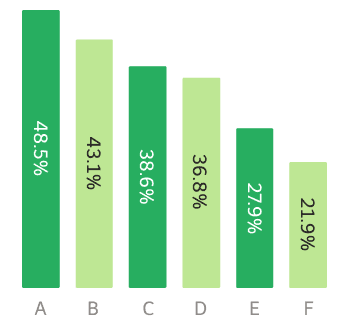
✅ Variants A and B were adopted as the recommended standard.
📈 Helped our clients reduce customer hesitation and improved order flow.
🧠 Introduced data-led design practices to Joyplux’s internal process.
Findings from the data
Collected Data
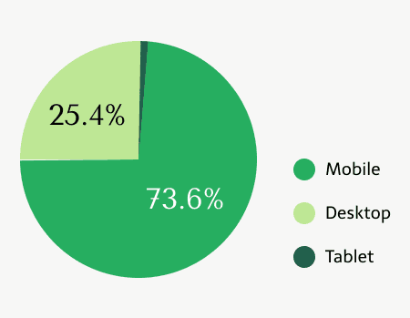
Total data amount: 280 (entries)
Valid data (repeated entries excluded): 266
Devices used:
73.6 % mobile
25.4 desktop
1% tablet
Efficiency
Variants A and B had the fastest task completion time.
Design Guidelines
Based on test results and usability data, we created three key design principles:

👉 Final Recommendation
Data has showed that variants A and B are the most understandable. Thus, the two designs should be prioritised as the standard design for the system.
Reflection
What I’d Do Differently
We underestimated the effort and resources needed to build and track the test sites. Scoping the project better in advance could’ve saved stress.