Side Project- 2025
# UI Design
# UX Design
# UX Research
# Usability
# B2C
# App

My Role
Product Designer
Deliverables
Design Research, UI Audit , User Testing, UI/UX Design, Project Management, Product Pitch
Duration
Feb 2025 - Feb 2025
Background
Nutracheck, a top calorie-tracking app, struggled to help users estimate calories when eating out. I identified key pain points through research, competitor analysis, and a UI audit, then redesigned the ‘Eating Out’ feature with clearer navigation and intuitive controls. The update improved task speed, usability scores, and overall user satisfaction.
Design Process

Desk Research
➊
Online Ethnography
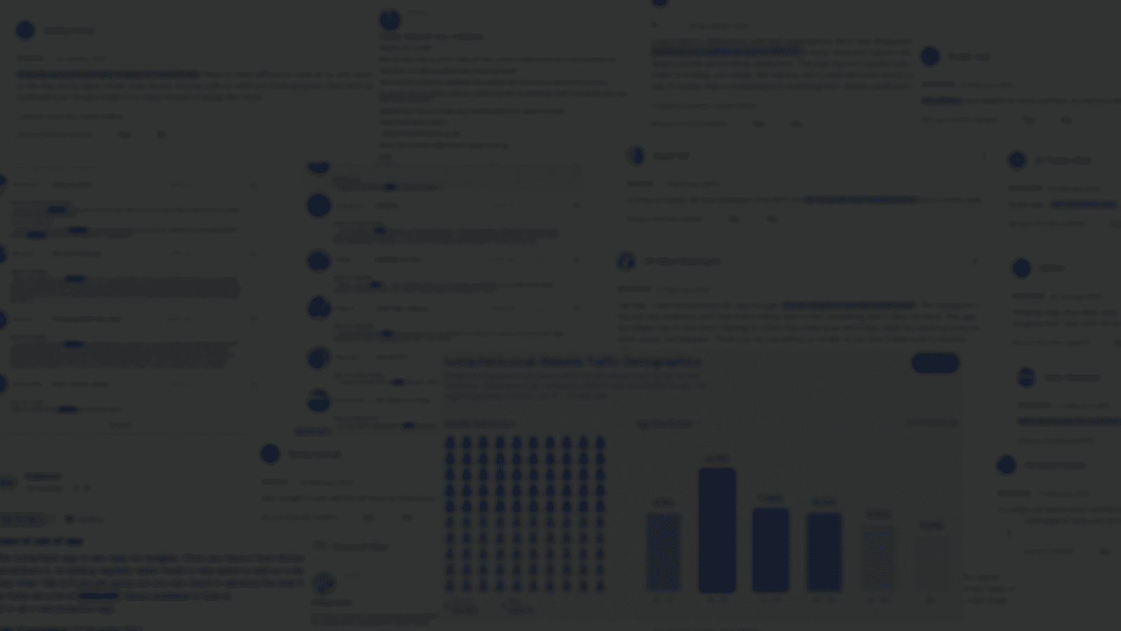
I conducted online ethnography to gather real user insights from the Nutracheck forum, Reddit, and app store reviews. These informed the personas, and journey map, which I used to identify design opportunities.


➋
UX Competitor Analysis
To understand UI/UX patterns that the potential users might be familiar with and used them as inspiration.

Insights
UX Goals for Redesign
UI Audit
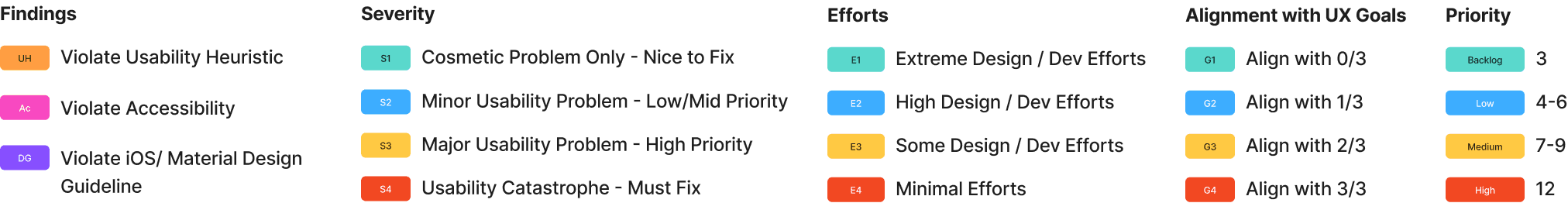
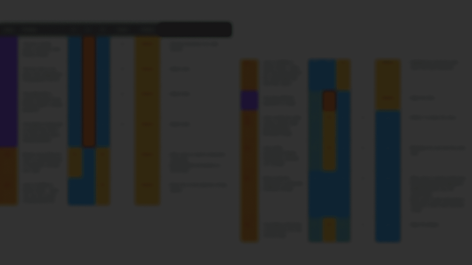
I evaluated the interfaces to identify UI enhancements, including:
7
findings related to usability heuristics
5
findings related to design guidelines

I prioritise them based on these:
What Works Well
Based on research insights + UI audit
01
Overall, it’s easy to use
(e.g. flexible ways like btn/gesture to go back)
02
Photos/icons help users to recognise
They help users to recognise rather than recall.
03
‘Eating out’ section is useful for users
And it’s something the competitors are lacking
04
The large UK-based database
As it made them feel included and it also helps with the accuracy.

Could Be Improved
Defining Solutions
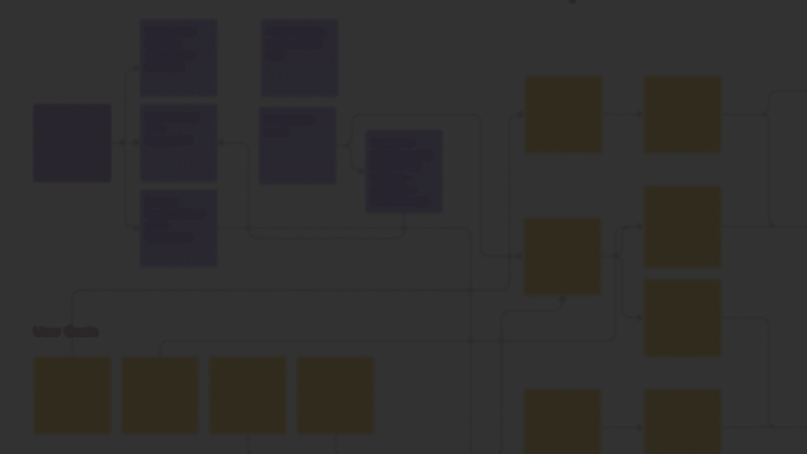
Listing Use Cases
When shaping the UX, I ensured the redesign covered all use cases by mapping out different user scenarios. From past experience, I’d usually involve product managers here to review and catch any gaps.

Clarifying with Flowchart


Design Execution
Wireframes
Before jumping into high-fidelity designs, I built wireframes to quickly iterate on ideas and refine the flow without getting lost in UI details too soon.

Feedback for Iterations & Validation
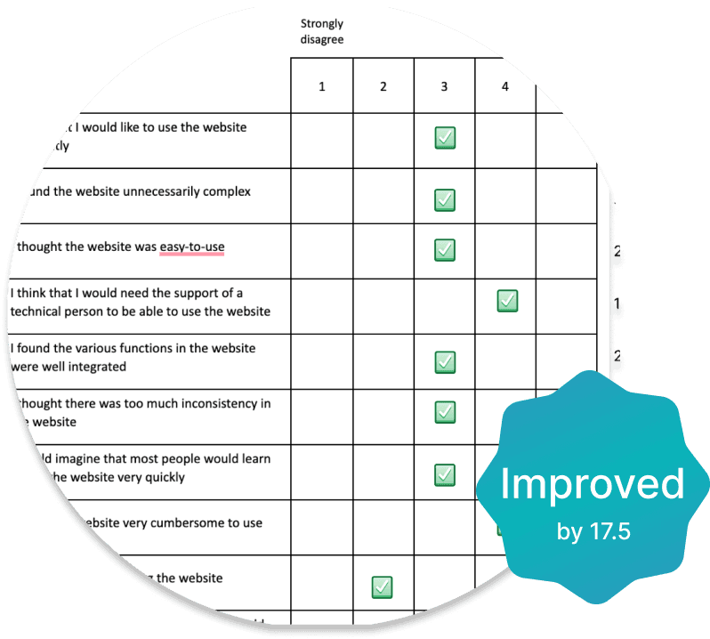
Through my design process, I always tried to get feedback of my work. The task completion time, rate, and SUS score all improved after the redesign.


Final Redesign
Prototypes Showcase
Unified icon style
→ Enhance consistencyUsed less colours
→ Cleaner interfaceEnhanced contrast
→ Easier navigationAdded more white space
→ Less cluttered


Combined 2 pages
→ Reduce stepsAdded ‘Search’ feature
→ Enhance efficiencyGrouped the items
→ Reduce cognitive load
Improved visual hierarchy
→ Easier navigationAdded more white space
→ Less clutteredAdded ‘Add to Fav’ feature
→ More future engagement
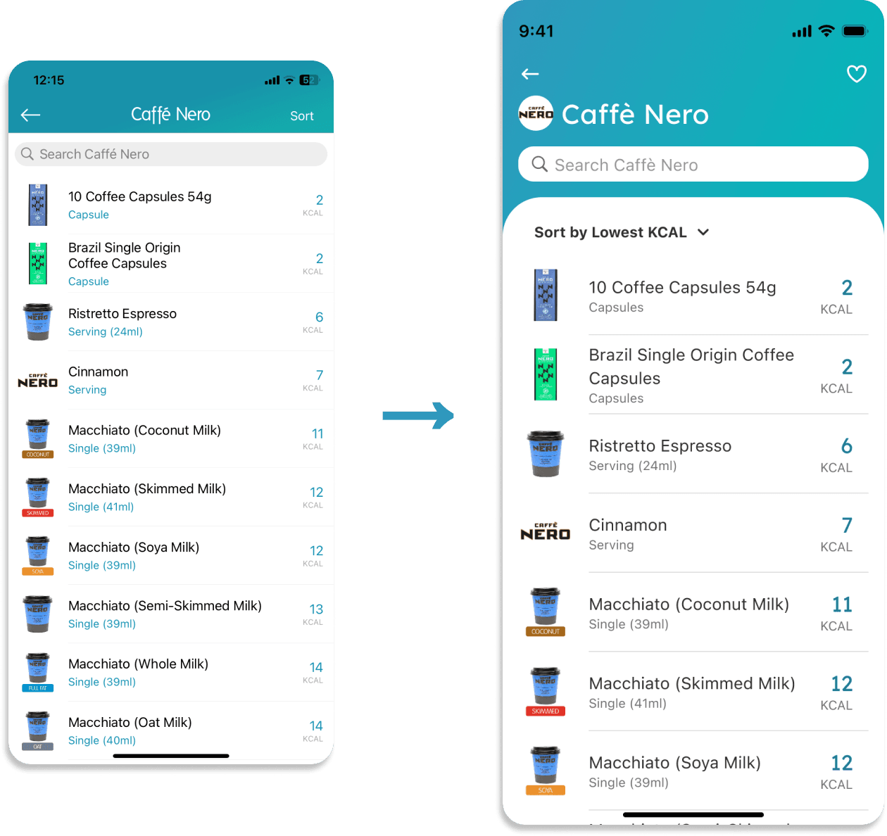

Adjusted proximity to regroup related items (Gestalt principles)
→ Easier to understandAdded ‘Add to Fav’ feature
→ More future engagement
Integrate with ‘Manually added’ feature
→ allowing users to manually add local restaurantsGuide users to the next steps
Search & compare similar food in other restaurants more easily
