Maison Margiela - 2023
# UX Research
# Website
# Usability
# Accessibility
My Role
Researcher, Designer
Team
Ailling Li (Researcher)
Amy Haynes (Researcher)
Elham Zare (Researcher)
👉 Emily Lin (Researcher, Designer)
Yuxin Chen (Researcher)
Timeline & Duration
Oct 2023 - Nov 2023 (6 weeks)
Overview
Most businesses nowadays have not only physical stores but e-commerce websites to facilitate online shopping for customers. OTB, Maison Margiela's parent company, had reported the values of the e-commerce channel in their 2022 financial statements. Acknowledging the importance, this research would investigate usability and accessibility issues of Maison Margiela's official website for a seamless online shopping experience. The research would ultimately result in re-design recommendations for two critical interfaces.
Challenge
As a school project, we were unable to contact the brand's actual target audience, nor could we involve disabled users in the accessibility assessment due to research ethics. These issues, however, were decided to be ignored because they had no significant impact on the results.
GOAL
The primary objective of this research was to evaluate the usability and accessibility issues within Maison Margiela’s official website to identify and re-design potential design opportunities for enhancing user-friendliness and the website's ease of use and ease of access.
Research process
Evaluation
Psychology Principles Evaluation
The foundation for further evaluations.
What can psychology principles help with?
➊
Understanding human behaviours
➋
Lowering users’ cognitive load
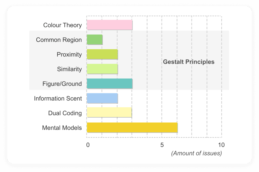
Among the total of 22 psychology principles issues were discovered. The violation of Gestalt principles, mostly relating to the layouts of UIs, and the mental model, where cognitive gaps exist, were relatively prevalent.
Heuristic Evaluation
The precursor for user testing plan and the framework for data analysis.
Jakob Nielsen’s 10 usability heuristics for user interface design (2020) was used as the guideline in this stage of the research.
The adoption of different approaches was aimed at evaluating from distinct perspectives, thereby ensuring pinpointing as many potential issues as possible.
➊
The website provided great help and documentation
People tend to incorporate another sorting stage between washing and drying, along choosing a mixed method of drying within a household (Yates and Evans, 2016). → People’s attitudes or behaviours would differ for washing and drying.
* Indoor drying (common for drying delicate clothes) could result in more waste of energy for gas central heating in winter (Menon and Porteous, 2011, cited in Pink, Mackley, and Moroşanu, 2015).
➋
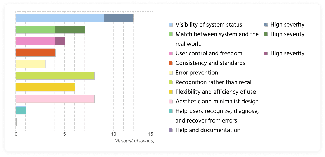
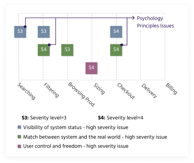
Key severe issues fell into the filtering, sizing, and checkout experiences.
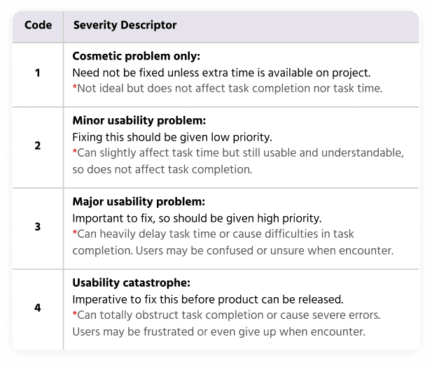
All identified usability issues were scored by the levels of severity. There were 7 severest issues found in the end, and they were most prevalent between the steps of finding a product and checking out.
User-based Evaluation - Quantitative Research
To quantify the performances based on moderated usability testing.
➊
Effectiveness, efficiency, and satisfaction as 3 primary dimensions for evaluation
According to ISO, effectiveness, efficiency and satisfaction are 3 pivotal dimensions of an interaction to evaluate usability. Thus, quantitative research was conducted to measure them.
➋
Filtering and sizing/checkout experience showed poor usability.
In the usability test, users spent the most time selecting sizes and checking out. Most tasks can be completed successfully. User errors included problems with finding products, the photo gallery and sizing. Overall, Tasks 2 and 4 were ranked lower on their average performance in each metric, indicating higher re-design priorities.

Task time

Task completion

Errors made

Lostness
User-based Evaluation - Qualitative Research
A deeper investigation into user cognition and behaviours.
➊
Additional approaches to understand and empathy users
An introductory interview was conducted before the usability test to understand their attitudes. Think-aloud protocol was also adopted during testing to understand the ‘what’.
➋
The results are consistent with previous findings.
The distribution of issues discovered in the qualitative test resembled that of the heuristic evaluation. Furthermore, as the issues were most prevalent during the sizing selection and checkout process, they corresponded with quantitative research.


Accessibility Analysis
Additional considerations to enhance the overall experience for all users.
This research only focused on WCAG 2.2’s:
3 categories: perceivable, Operable, and understandable
2 conformance levels: A or AA.
Also, the assessments were carried out both manually and automatically.
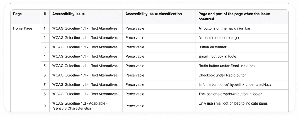
93.3% of accessibility issues were ‘Perceivable’
Among the 45 accessibility issues, 42 out of them were under the category of ‘Perceivable’, along with 2 ‘Understandable’ issues and only 1 for ‘Operable’. Most of the ‘Perceivable’ violations were related to missing alternative text.

Compose
Research Findings
A conclusion of what we discovered.
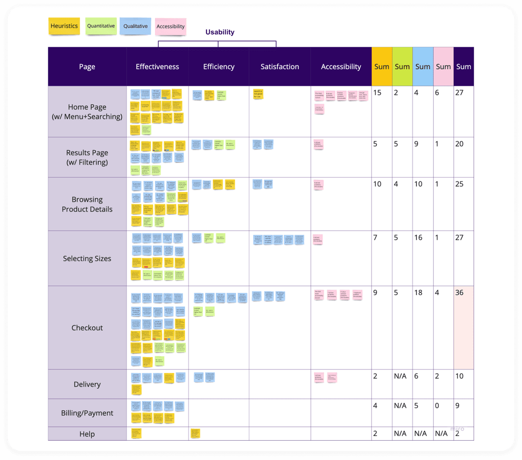
A data summarisation, including compiling the data and structuring the data, was carried out so as to cluster insights.
➊
Most of the issues were effectiveness-related
Each post-it was written with one issue that was extracted from the previous evaluations and was categorised by page, usability and accessibility. It was found that most usability issues were under ‘effectiveness’.
➋
The pages of sizing and checkout were the most problematic.
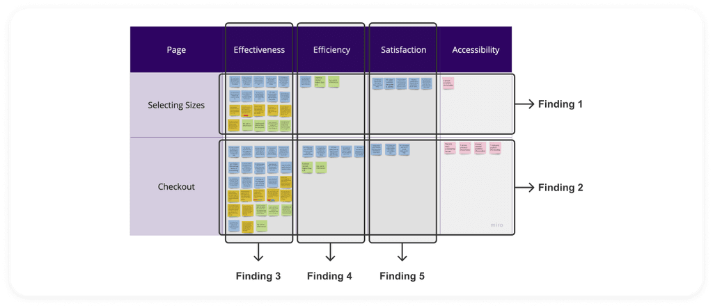
The checkout process had the most issues. And a decision was made to prioritise the size selecting experience over the home page (which had the same number of issues) as size selecting is often closely intertwined with checking out. In the end, 5 key findings were extracted from these pages to cluster insights.
Clustering Insights
Interpreting the meaning and the importance of the findings.
The insights were derived from the 5 key findings concluded in the previous step. While each finding describes what was seen/heard, a deeper thinking into the meaning it may represent, and the explanation of why it is important to be addressed was provoked.
What we saw/heard? (Findings)
#1
The information in size guide is not intuitive nor well-explained enough for user to understand
#2
When adding items to bag, the indications of a current or possible results was unobvious.
#3
Informative or interactive elements failed to indicate their meaning or function clearly.
#4
Users had to make extra efforts to complete checkout.
#5
User's expectations were higher than the website's performance.
↓
What it means?
Users were unable to figure out the correct size to select.
Users may felt confused and lost during the progress.
Users were more likely to make errors.
It may cost users more time to achieve a goal.
Users got disappointed and annoyed.
↓
Why it matters?
Users may dare not to order. Or if they do, they may select a wrong size and need to return.
Users may be frustrated, resulting in low satisfaction.
Users may want to seek help (e.g. customer/IT support), increasing the cost of that aspect of the company.
Users are likely to lose patience and give up on making a purchase.
Users may think the function is not well-constructed and lose trust to the brand.
➊
Usability Issues may impact orders, costs, and brand trust.
3 out of 5 of the final insights suggest that usability issues may not only affect user experience, but may also cause negative impacts on business values such as losing orders, increasing potential costs, and the image (customers’ trust) of the brand.
➋
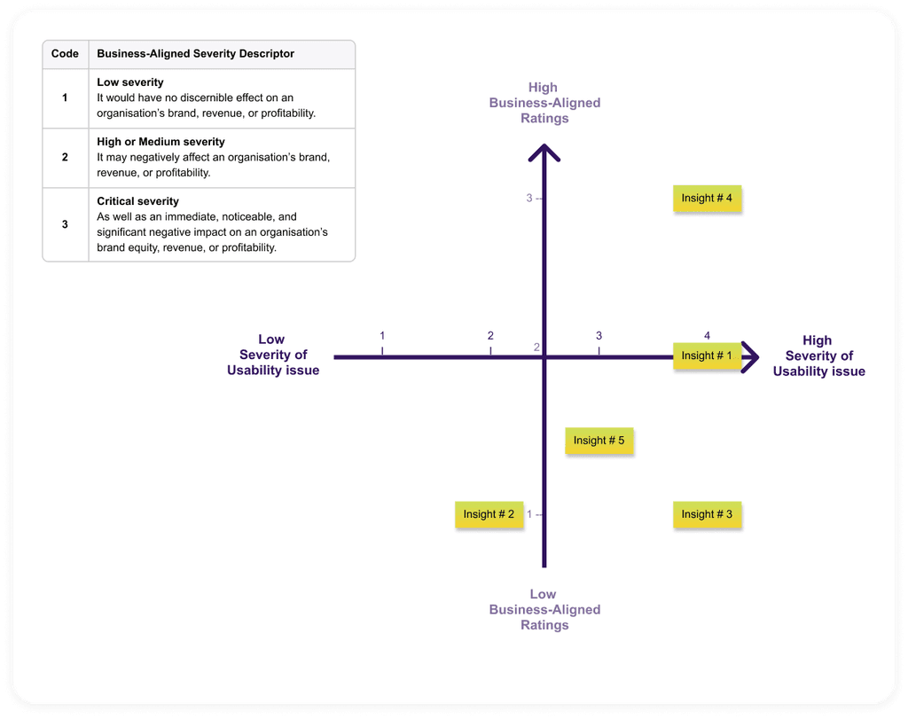
Issues that slower the task time (Insight 4) should be prioritised.
The insights were prioritised by 2 measures: the usability severity and the potential influence it may have on business. The severity level of business-aligned ratings was adjusted based on the business-aligned usability ratings by Paul J. Sherman (2010).
The Insights
Users were unable to figure out the correct size, which may make them dare not to order. Or if they do, they may select a wrong size and need to return.
Users may felt confused and lost during the progress, which may make them feel frustrated, resulting in low satisfaction.
Users were more likely to make errors, so they may want to seek help (e.g. customer/IT support), adding the cost of the company.
It may cost users more time to achieve a goal, so users are likely to lose patience and give up on making a purchase.
Users get disappointed and annoyed, which may make them think that the website is not well-constructed and lose trust in the brand.

Re-design
Recommendations for Re-design
➊
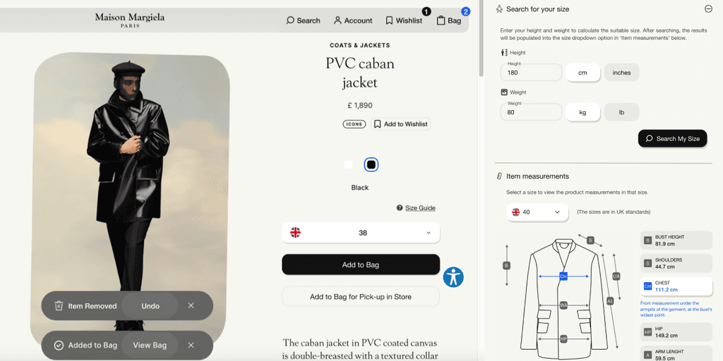
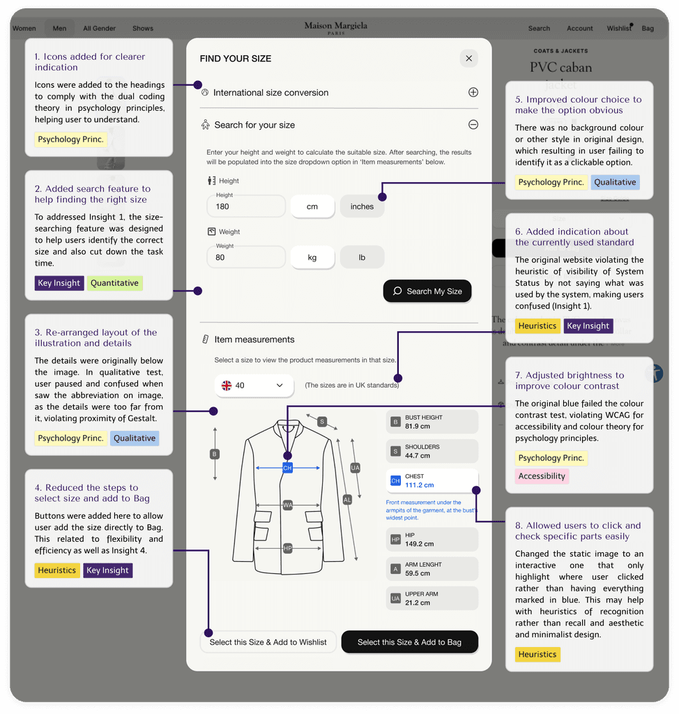
Sizing information
Originally, an international conversion chart was provided for users; however, it appeared unhelpful for users as they didn’t know which standard is used by the website. Also as the core feature users needed was to gain the information regarding which size to select, it may be more straightforward and efficient to allow them to search for the answer.
➋
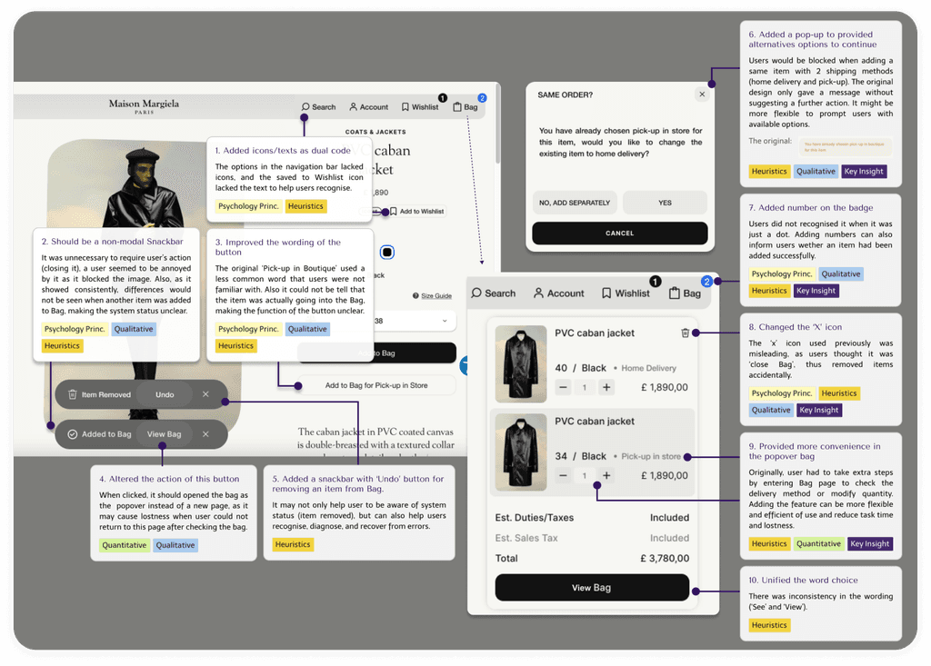
Checkout (Add to Bag)
The re-design of the checkout page mainly focused on the interaction and interfaces of adding an item to a bag. The modifications made are shown below:

Reflection
Improvements
➊
Lack of neutrality in usability test instructions
For the quantitative usability test, the way we described the task could be more neutral and without mentioning the same words used on the websites to avoid guiding the participants, such as ‘Bag’, and ‘size guide’.
➋
Missed communication about the qualitative research method
There was a delay in communicating about the introductory interview of the qualitative evaluation, which affected its execution. Most group members had already completed testing with participants by the time the discussion took place. This miscommunication hindered the opportunity to collect more contextual data for participants.
Learnings
➊
Teamwork is the best way to deepen understanding and gain diverse views
Group discussions in this project played a crucial role in helping me to learn, provoke ideas, and manage the progress of the project.
➋
Gained understandings about usability and accessibility
Previously, although I had read about heuristics evaluation, I never really understood how and when to apply it. The WCAG guidelines were also confusing to me, but now, I finally understand how they work and their importance.
