Loughborough University - 2024
# Interaction Design
# VR Design
# Storytelling
Team
Emily Lin, Miki Doi, Karinz Wei, Ring Chen
My Deliverables
Secondary Research, VR Interaction Design, Virtual Prototyping, User Testing, Data Analysis
Timeline & Duration
Feb 2024 - Mar 2024 (6 weeks)
UX Vision Statement
We believe that there is an opportunity to design an immersive Virtual Reality (VR) solution for young UK tourists who care about the future and personal growth but lack awareness of their environmental footprint, that encourages them to make more active pro-environmental decisions.

Background & Problem
our goal
UN TARGET 14.1 - REDUCE MARINE POLLUTION

By 2025, prevent and significantly reduce marine pollution of all kinds, particularly from land-based activities, including marine debris and nutrient pollution.
Why did we focus the goal?
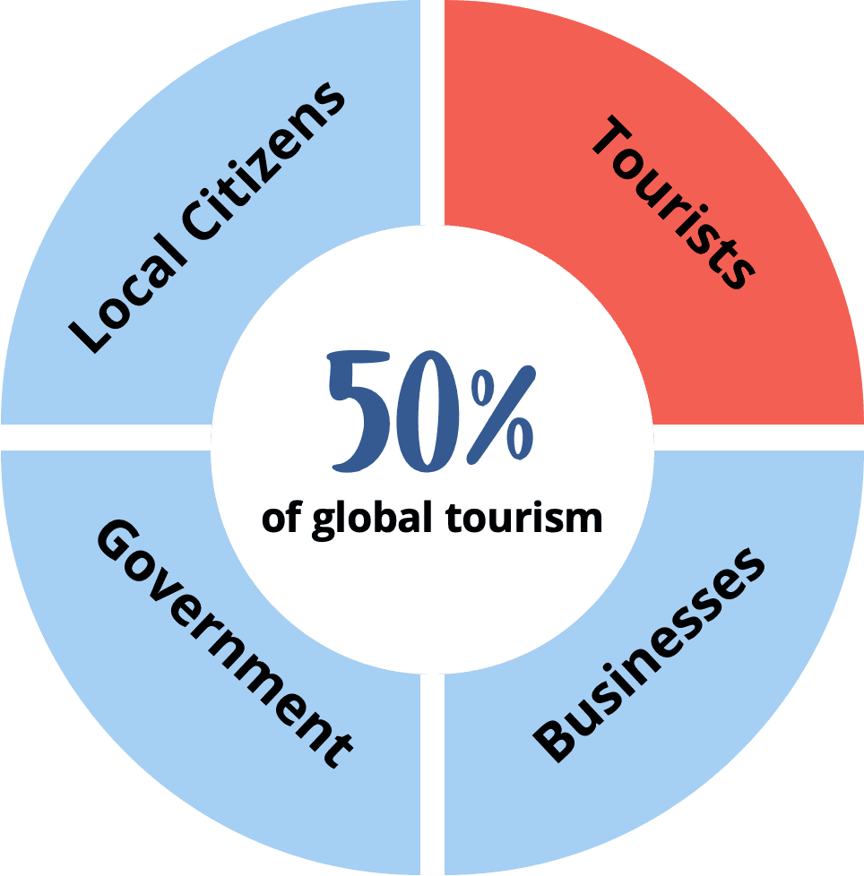
Through secondary research, we learned the importance of the issue as below.
Why Tourists?

Solution
Inspired by the wisdom of Chinese philosopher Xun Zi, we've created an interactive VR solution that encourages tourists to adopt sustainable behaviours by involving them in scenarios of marine pollution, allowing them to experience the consequences of their actions first-hand.
Context of Use
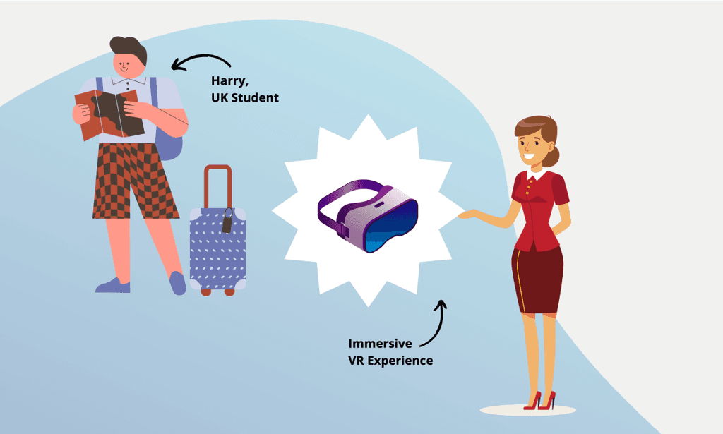
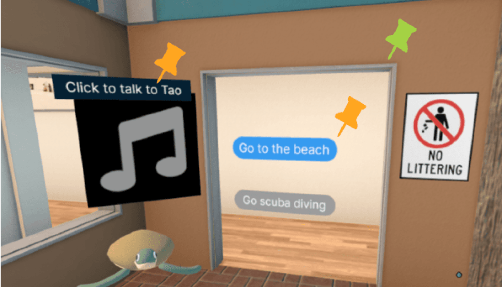
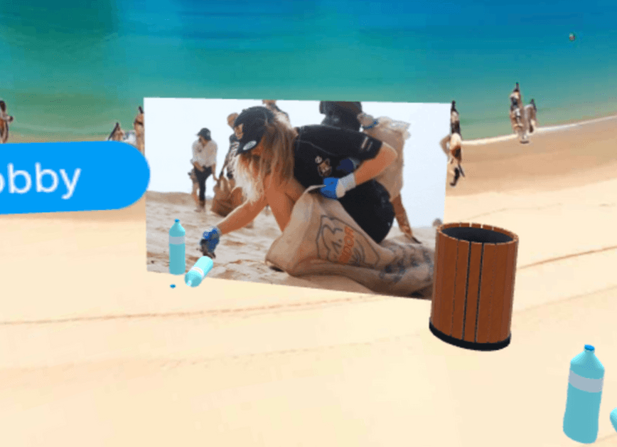
While waiting to check in at their hotel in Thailand, the staff offers Harry, our proto persona, and his friends a free VR experience.
Final Prototype
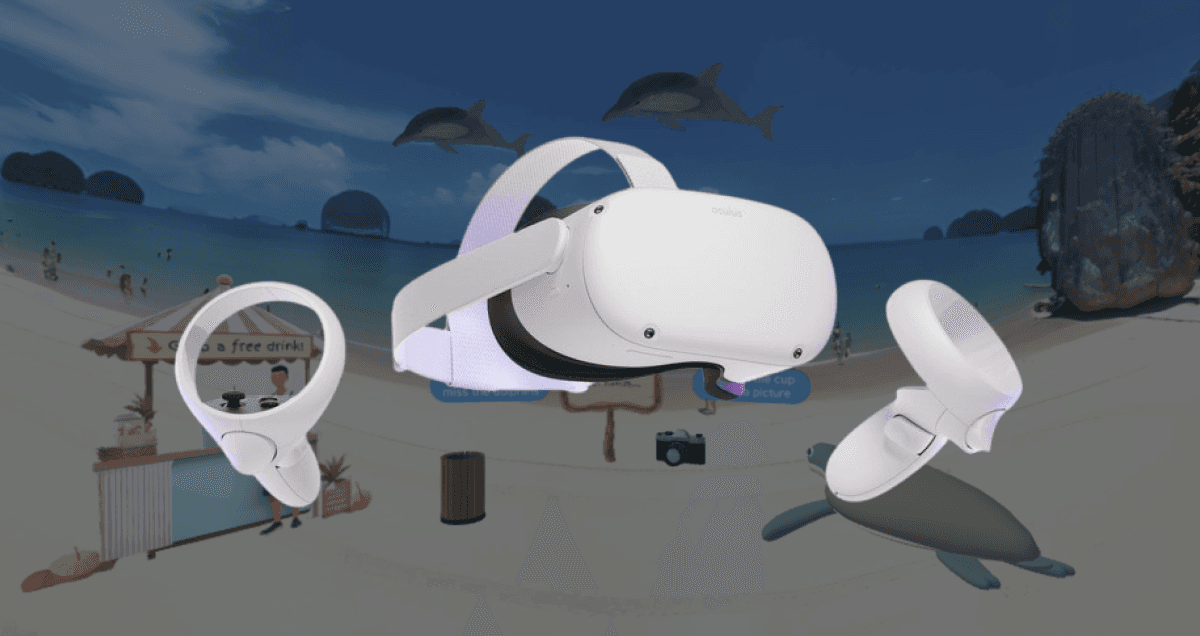
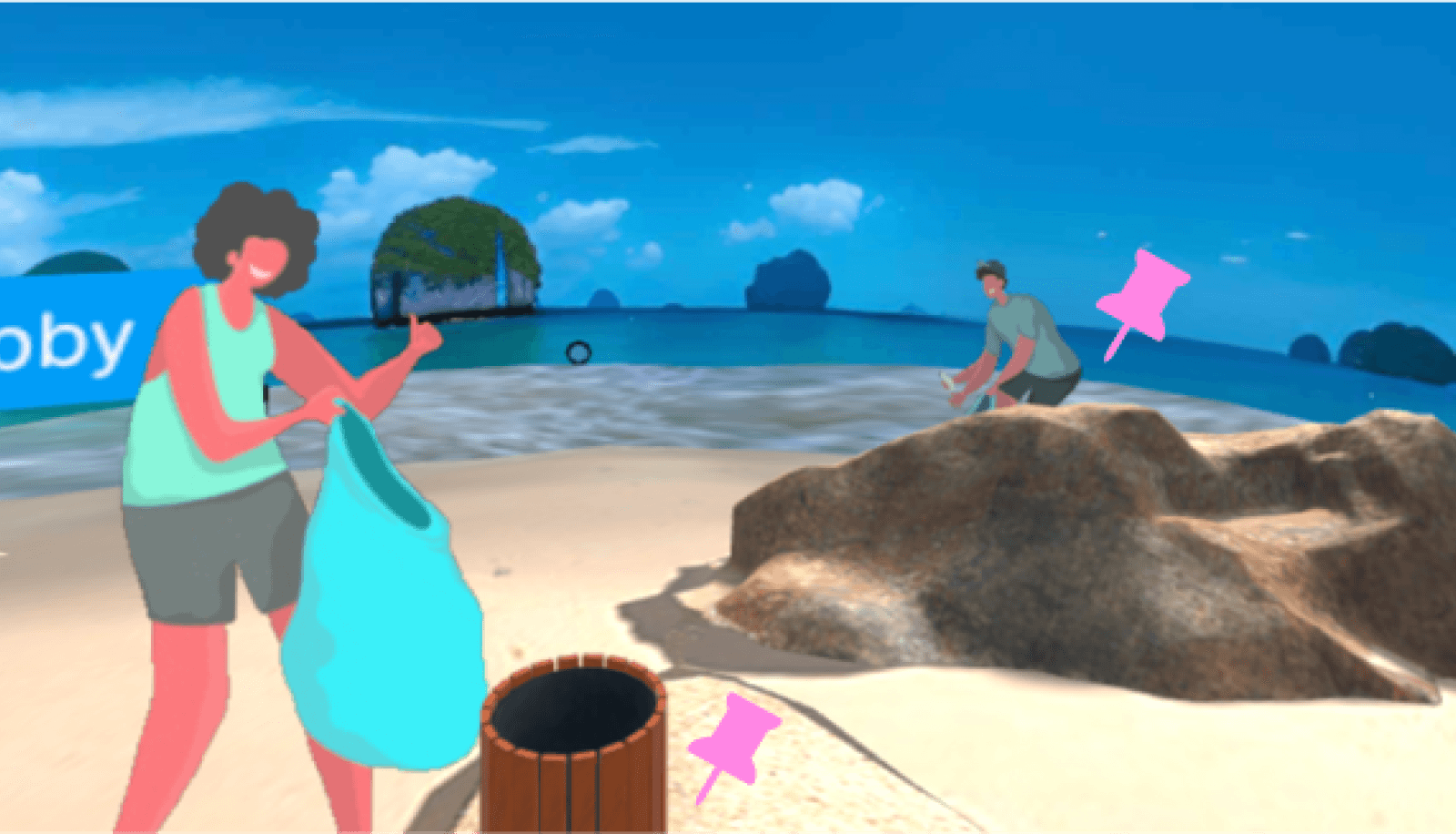
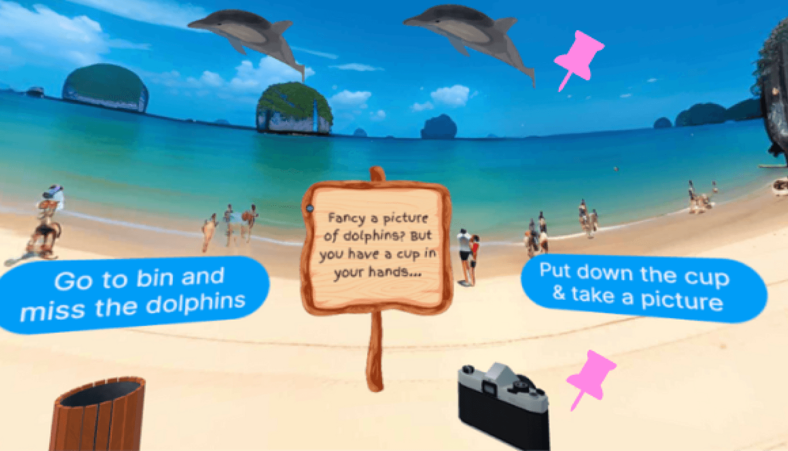
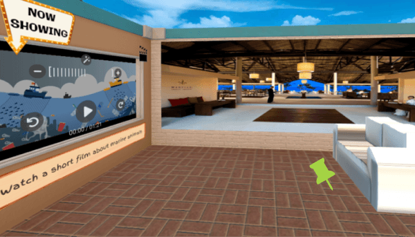
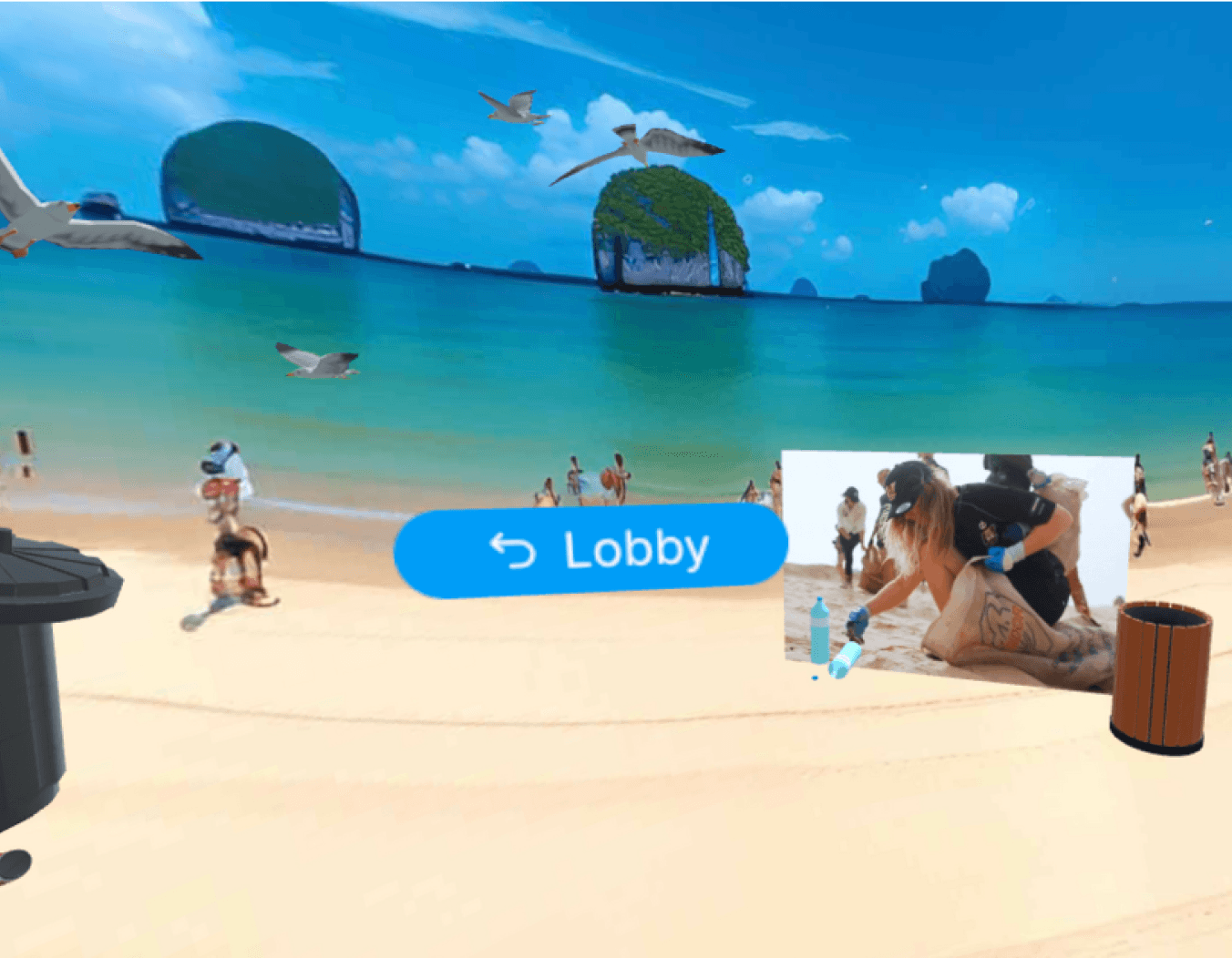
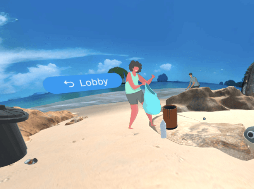
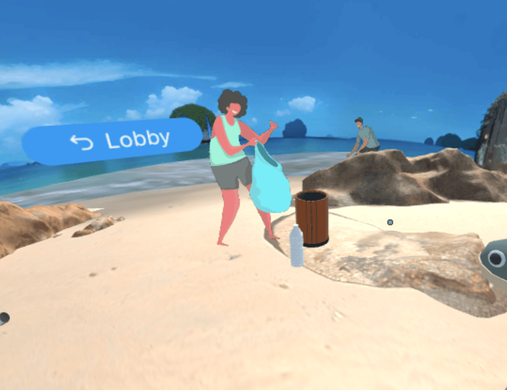
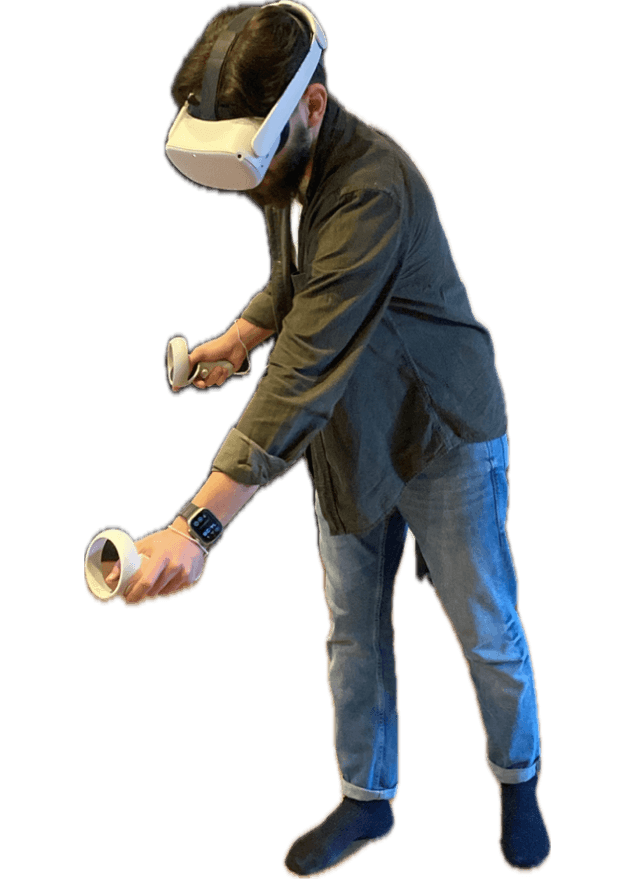
The journey was recorded using a Meta Quest 2 VR headset.
The Follow on Experience
After the VR experience, Harry can sign up for the Hotel's mailing list to receive information regarding eco-friendly volunteering activities i.e. beach cleaning. We aimed to promote social connection and continuous learning among the hotel guests.

Design
Design Process
Starting from research to the final output, we took these 4 main steps of the iterative design process,
proto-persona
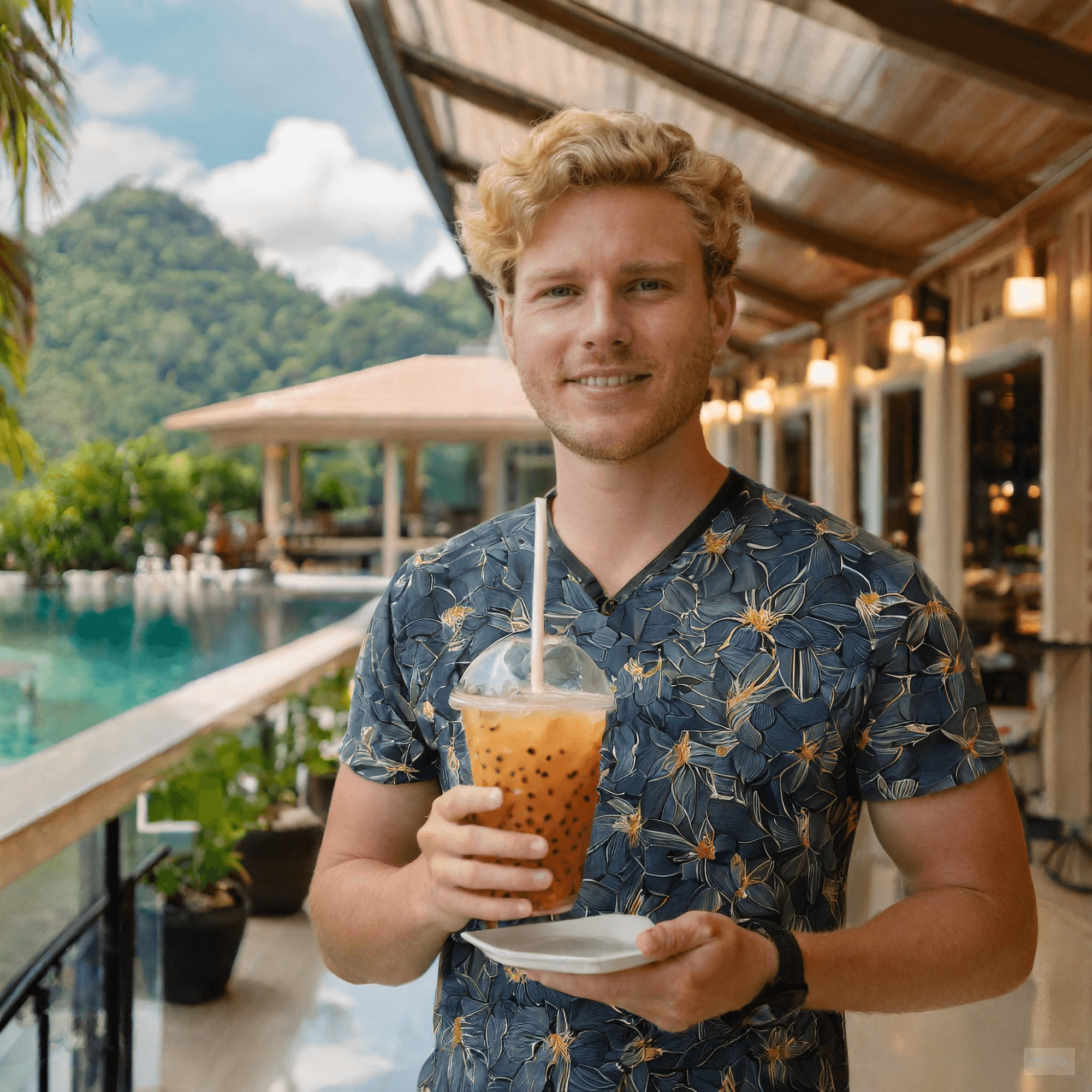
The proto-persona, Harry French, was created based on our research result. Our findings indicate that younger men show less intention toward environmental maintenance. However, at the same time, they tend to be more future-oriented and open to new ideas compared to older generations. This insight presents an opportunity for us to design with a focus on these characteristics.
Research Findings
UX Vision Statement
Design Principles & Opportunities
Design Principles
The design principles guided us in identifying opportunities in our solution:
💡 Inspirational
Inspire users to imagine and plan for the future they want.
🙌 Engaging
Engage with objects in the VR to establish greater empathy towards marine life by providing a captivating experience.
⛰️ Adventurous & Explorational
Empower players with a sense of agency by allowing them to shape their journey instead of following preset steps.
Guide
VR Opportunities
Awe & Nature Connection
+
Ecological Experience Learning (EEL)
Pro-environmental behaviour
Flowchart
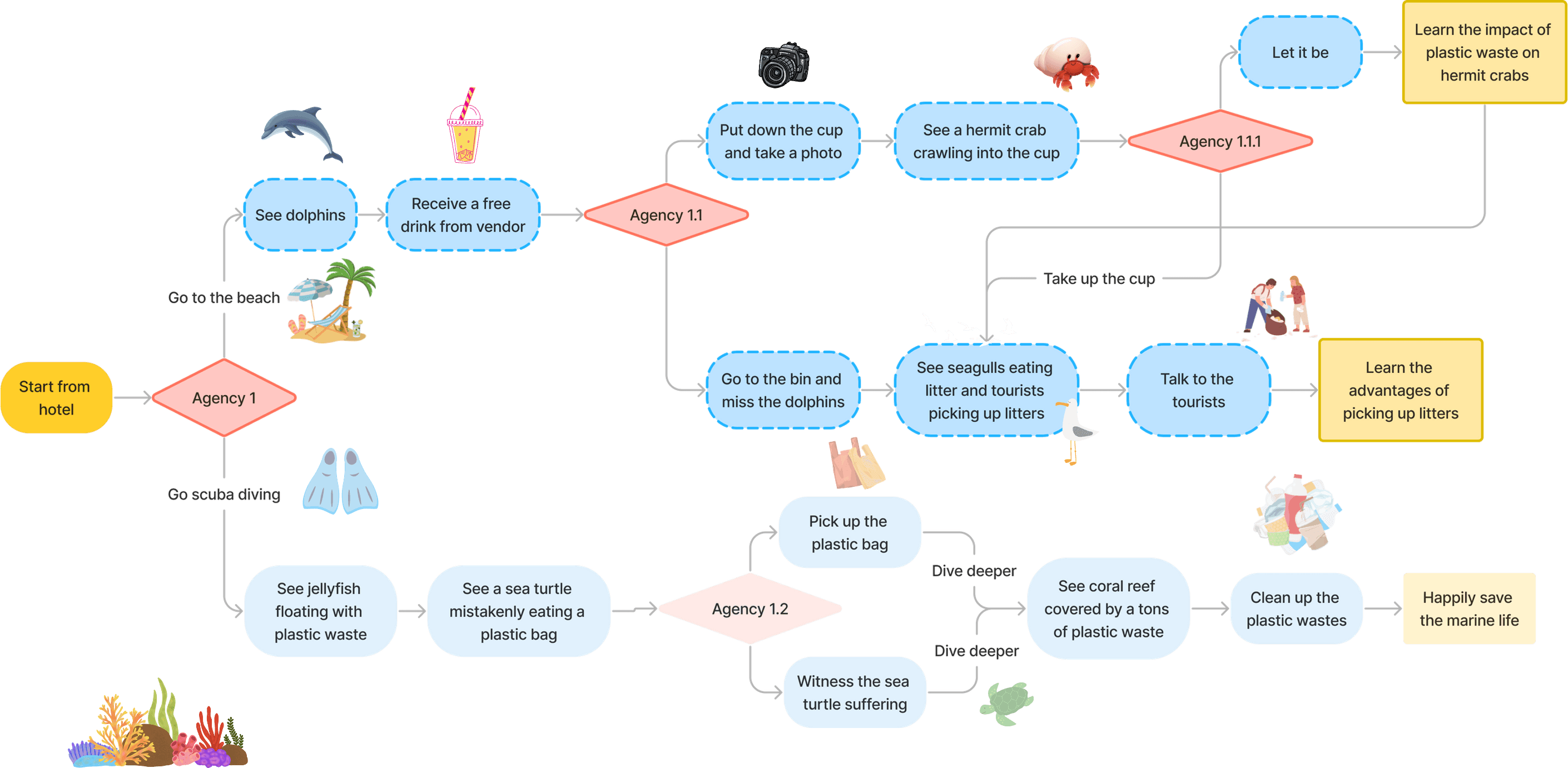
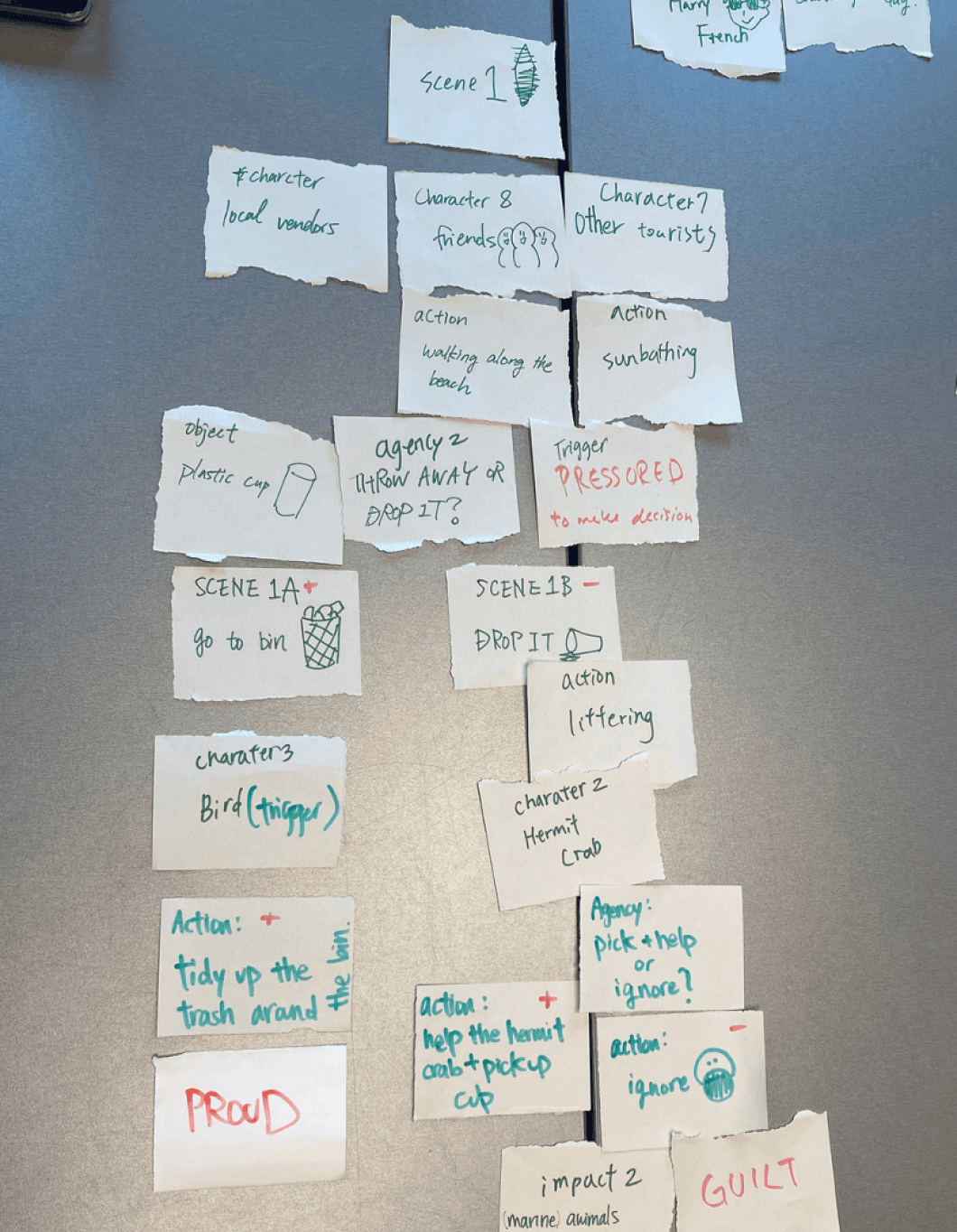
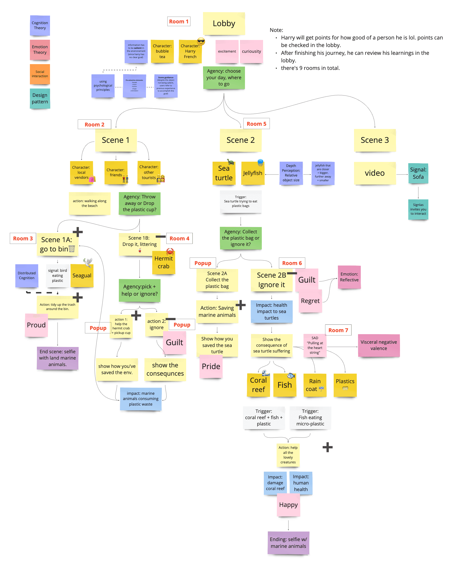
In combination with identified opportunities and design principles, we developed the following flowchart outlining the entire virtual experience and storylines which promote user agency. Due to time constraints, we decided to prototype one flow for our vertical slice (VS).
Ideate Process with Sketching
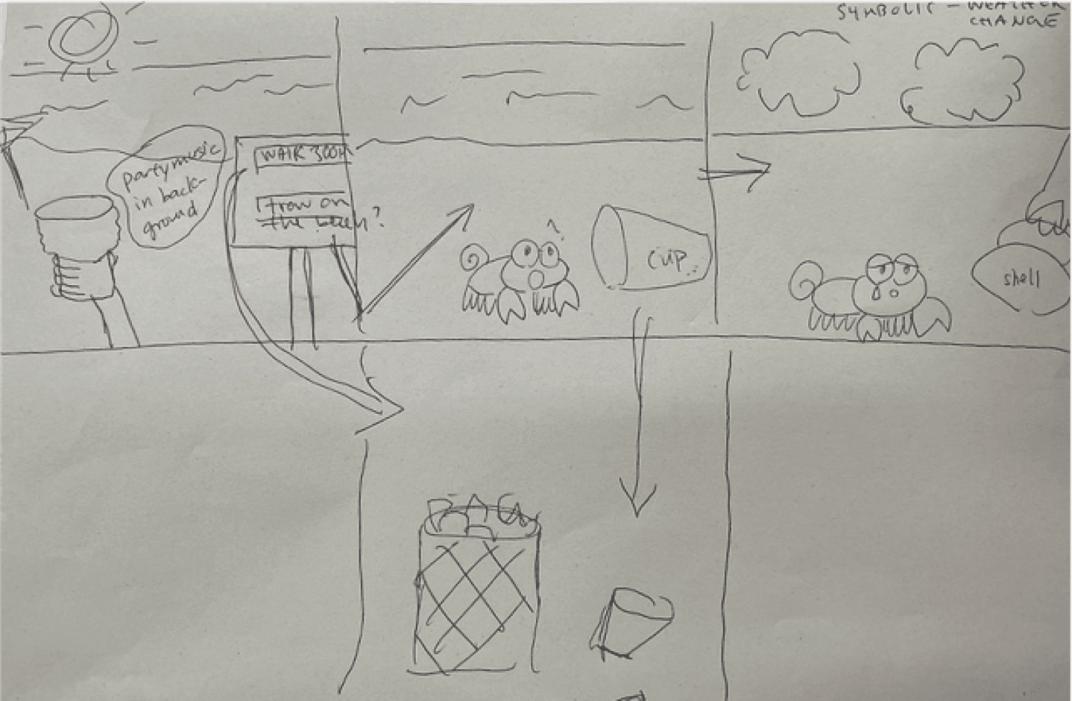
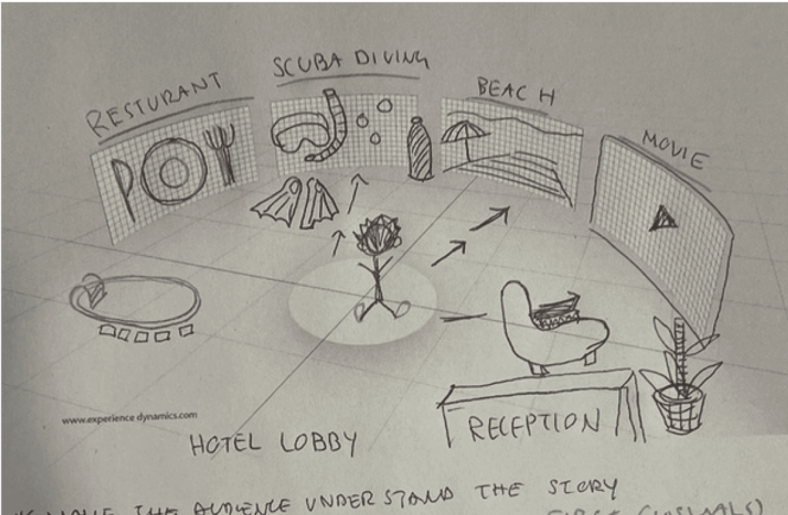
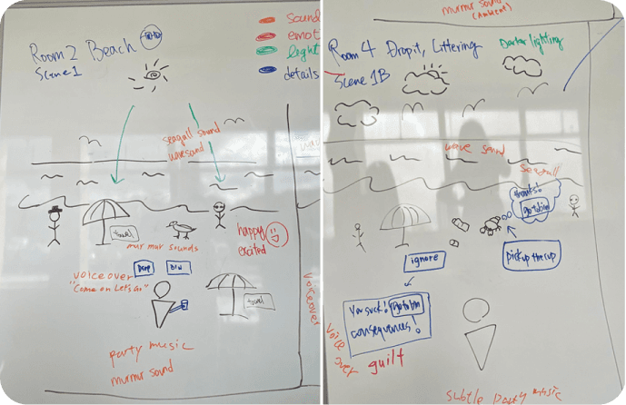
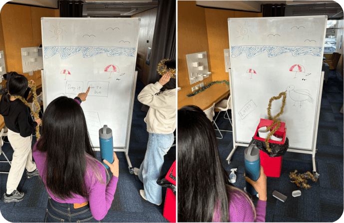
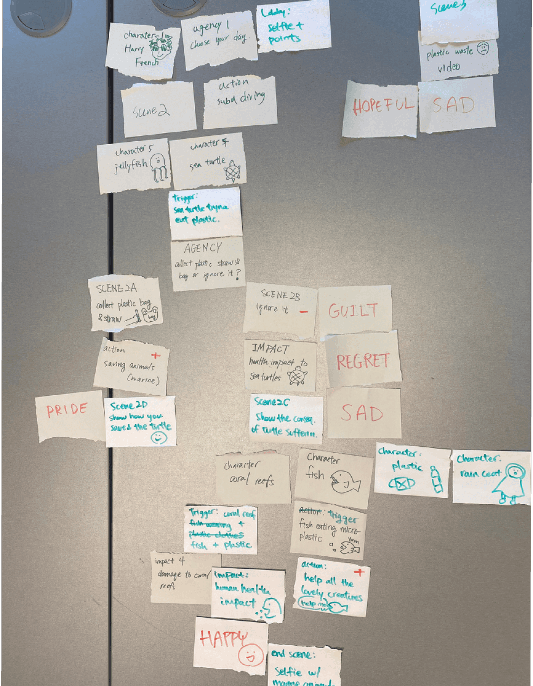
To develop the flow and storyline, we started by sketching out each scene on paper and then proceeded to body-storm to better sense the flow including the level of agency and emotions. This process helped us identify potential weaknesses in our storyline, allowing us to iterate before creating higher-fidelity prototypes.
05 - Finalising story path
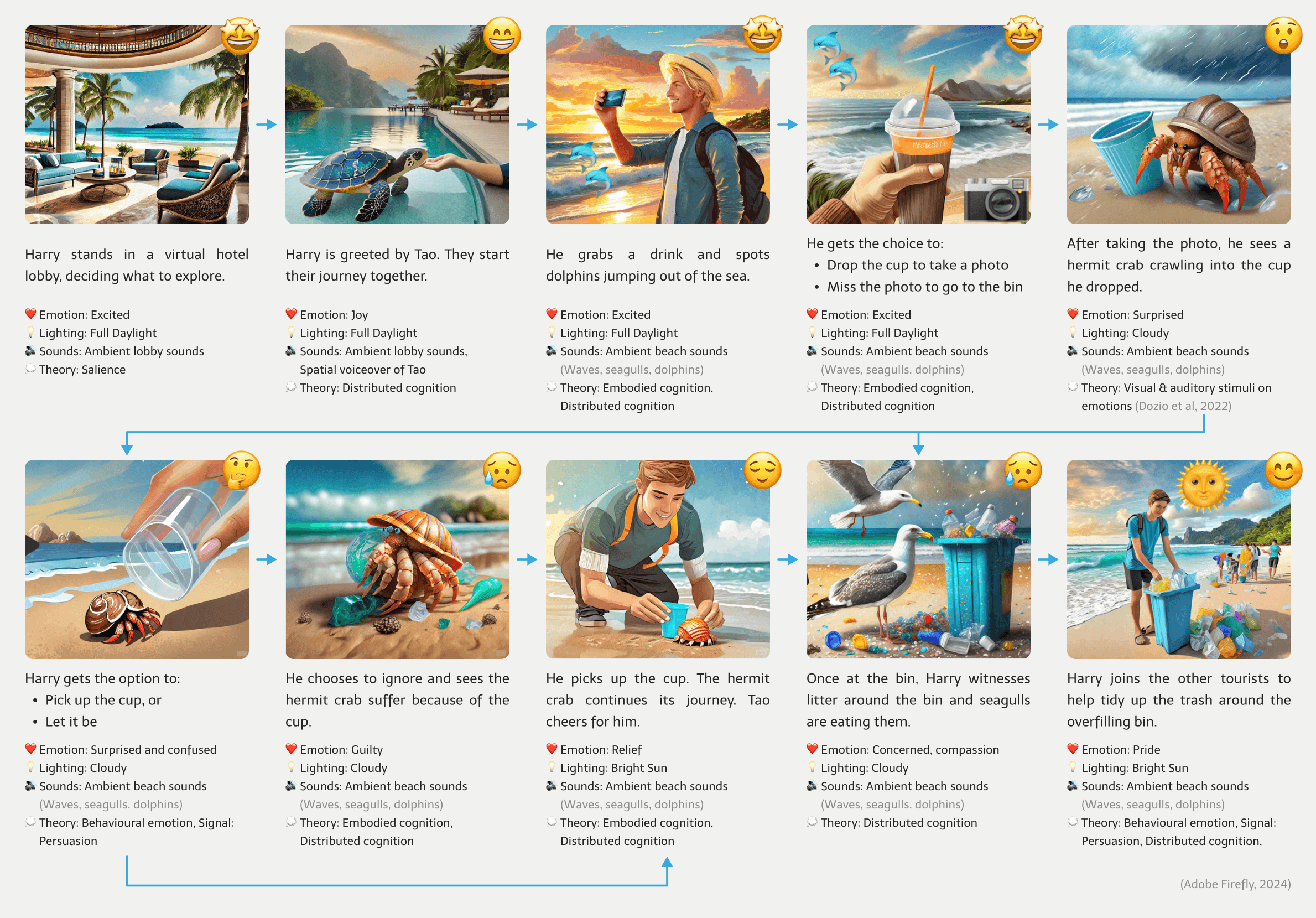
Final Storyboard
We realised after body-storming that we needed to establish some form of bond between the user and the characters to enhance empathy.
As seen in various animal documentaries, providing animals with distinct identities (such as sea turtle Tao, hermit crabs, and dolphins) can induce a stronger emotional attachment among the audience. Hence why we created our main character, Tao the sea turtle, as a companion and guide in the story.
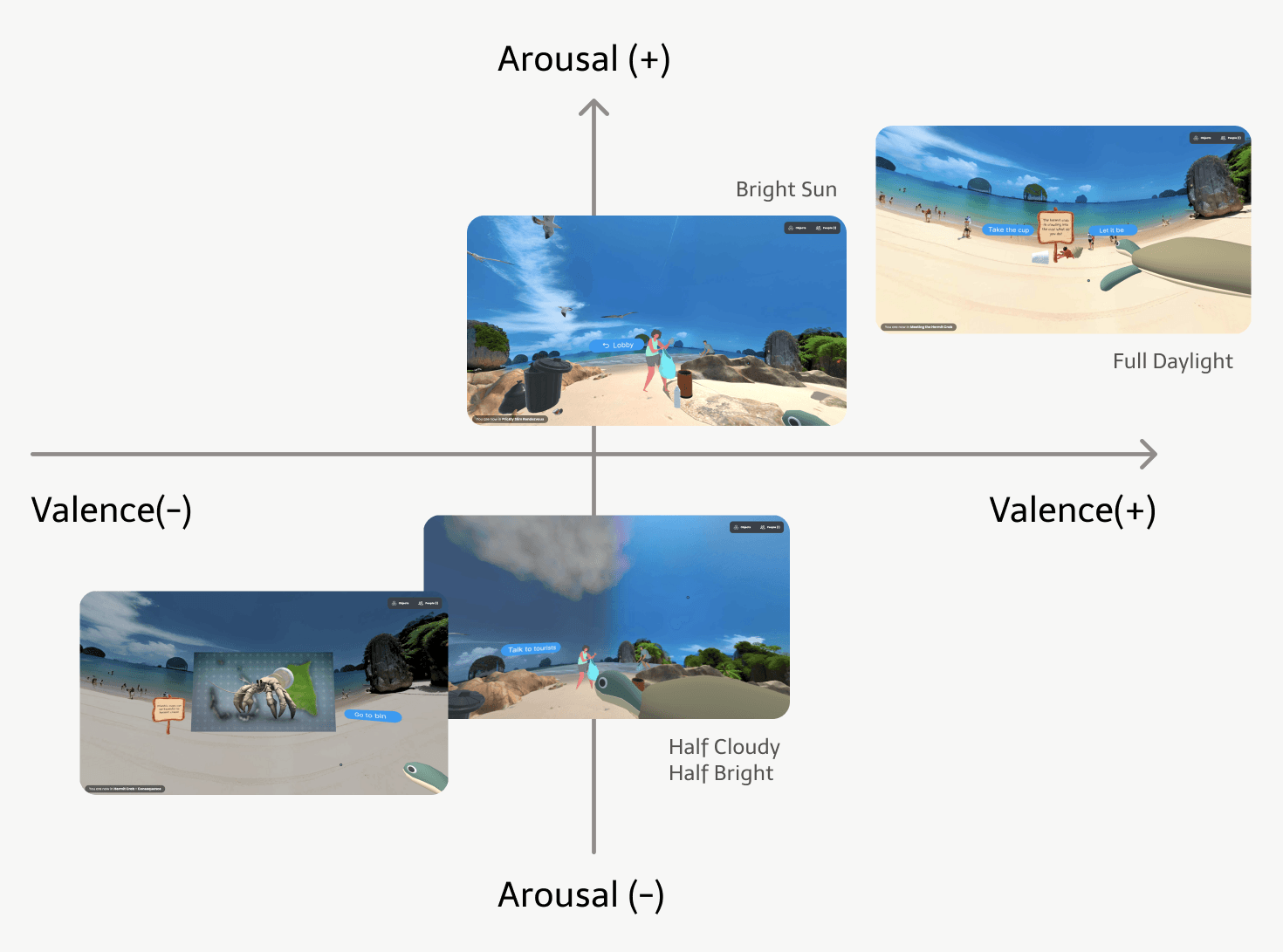
For each scene, we also aligned sensory elements like emotions, lighting and sounds that applied human factors and cognitive theory to enhance the desired emotions and presence.
Design Patterns
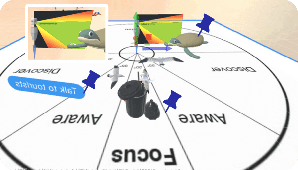
To enhance cognitive immersion, we've placed objects by applying design patterns like horizontal and vertical alignment. Below are the main patterns involved.
Emotion Design
Visceral visual stimuli were considered as guidance when designing emotions in our scenes. For example, we darkened the background and lowered the geometric complexity for the bad consequences scenes to create negative valence and low arousal emotions.

Iteration
User Testing
We conducted 3 rounds of user testing and measured 3 main aspects, which include presence, emotions, and experience, using the respective methods to measure our results.
User Testing

Tuning

User Testing

Tuning
User Testing

Validation
Positive Feedback from Testing
We received positive feedback that validates our design approach. For instance, participants remarked that Tao was an engaging and friendly companion, affirming the value of Tao. Furthermore, our design was shown to align with users' mental models and evoke desired emotions, such as sadness upon witnessing seagulls eating litter.

Proven values of “Tao”
“It's more engaging to have a character with you, and not just a voiceover in the background.” - P4
“ there was definitely a little sense of trust ” - P3
“it's quite nice having a sort of companion in there. Someone to sort of guide you along the way” - P2

Matching Mental Models
“I'm tempted to almost walk forward. I forget that I'm in an actual room.” - P2
"The interactions are simple but it makes you feel like you're actually doing something" - P4

Desired Emotional Responses
“That's very sad. [seeing seagulls]...eating rubbish.” - P2
“After seeing the tourists picking up the trash, It wasn't like a guilt trip sort of experience.” - P2
Improvements from Testing
We received positive feedback that validates our design approach. For instance, participants remarked that Tao was an engaging and friendly companion, affirming the value of Tao. Furthermore, our design was shown to align with users' mental models and evoke desired emotions, such as sadness upon witnessing seagulls eating litter.
01
Lack of Presence
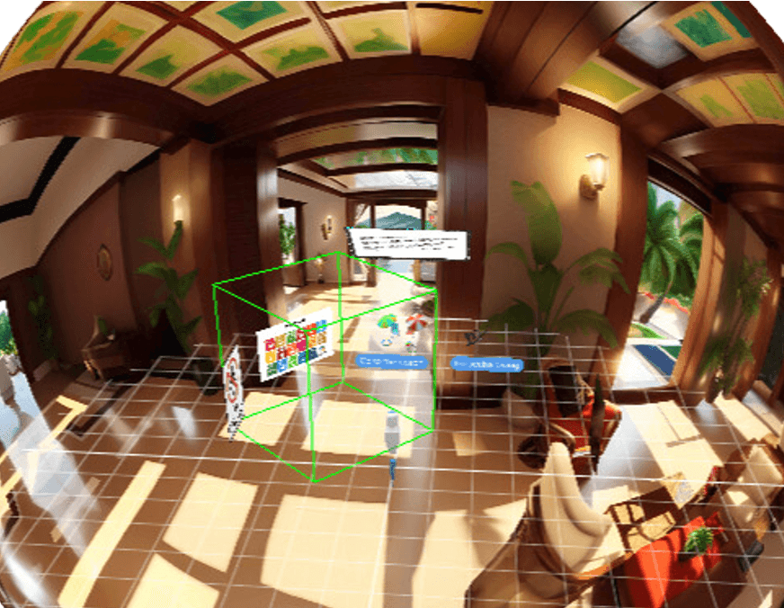
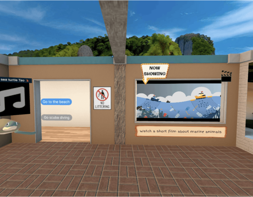
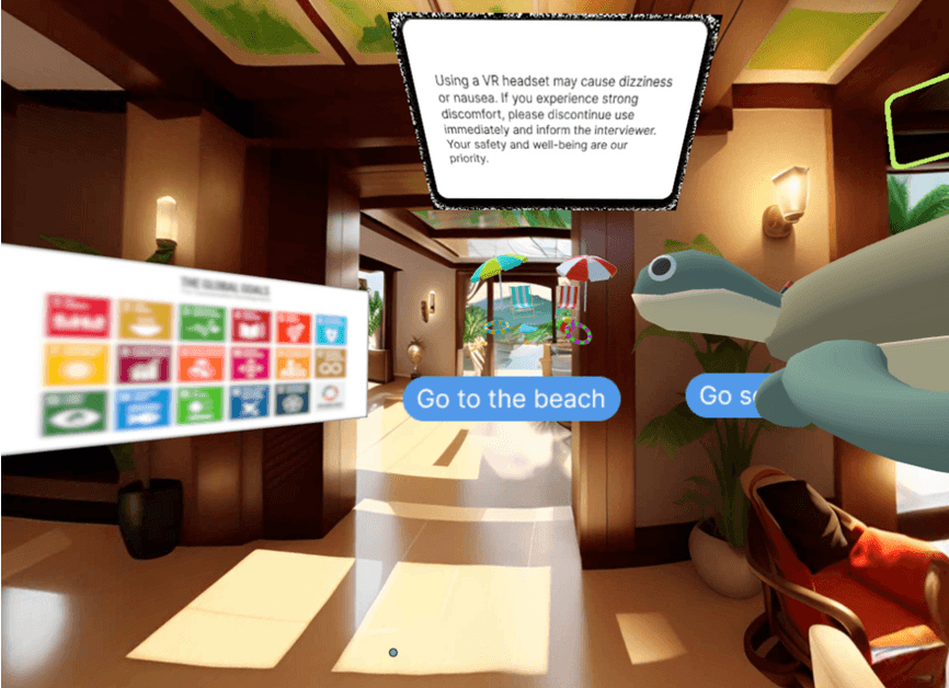
At first, there was a lack of presence. The sphere seemed to reduce presence as it made some environments look unrealistic and objects 'floating', which mismatched users' mental models. To address this, we incorporated 3D rooms and models into the scenes to enable greater exploration and enhance presence with place illusion.
“Can't look around in the hotel lobbies.” - P1
“The bins seem to be floating” - P3
“if you move around that sphere looks slightly strange” - P2
Before
After
Theories:
Scenes:
02
Mental Overload
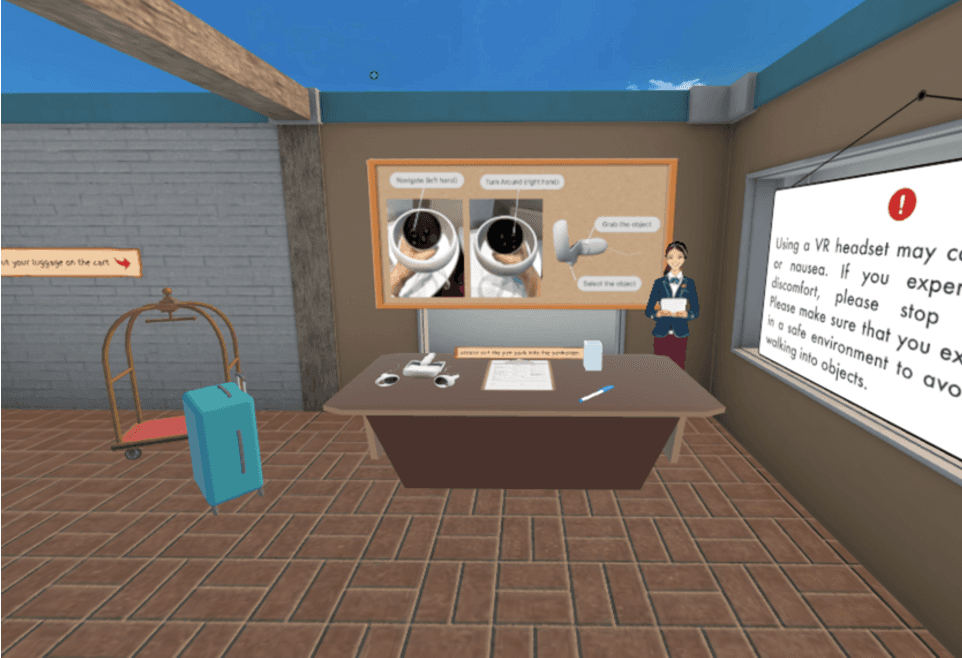
Additionally, we observed that users experienced "mental overload" as they initially relied solely on the instructions before testing. To alleviate this strain on working memory and enhance the user experience, we added visual signals such as written instructions for controller navigation and improved overall visual search capabilities.
“Tao added some context which was helpful in the absence of sort of on-screen written instructions or navigation.” - P2
“It was hard to know what to do next, it was hard to navigate...I only figured it out later” - P3
Before
After
Theories:
Scenes:
03
Ambiguous Objects
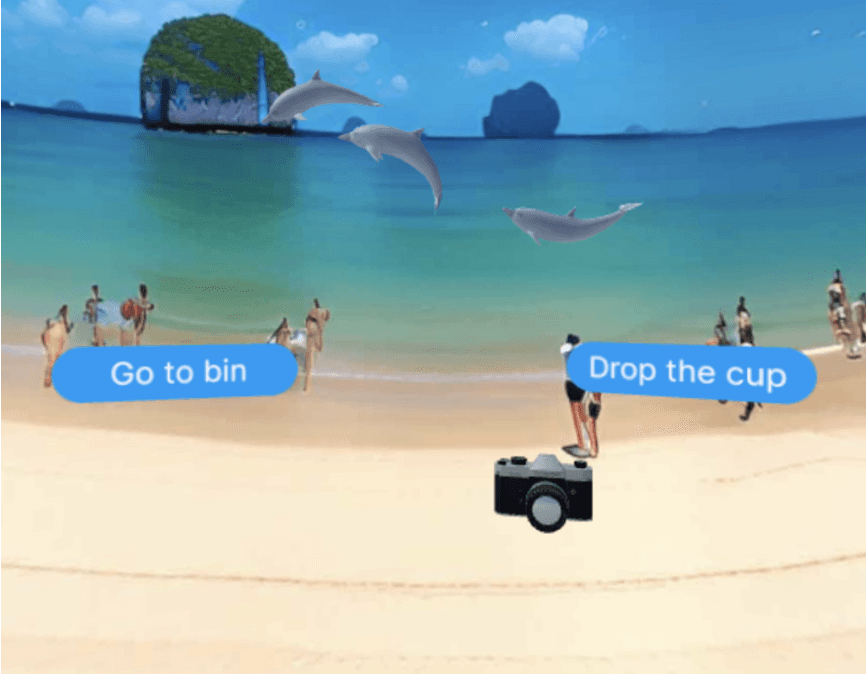
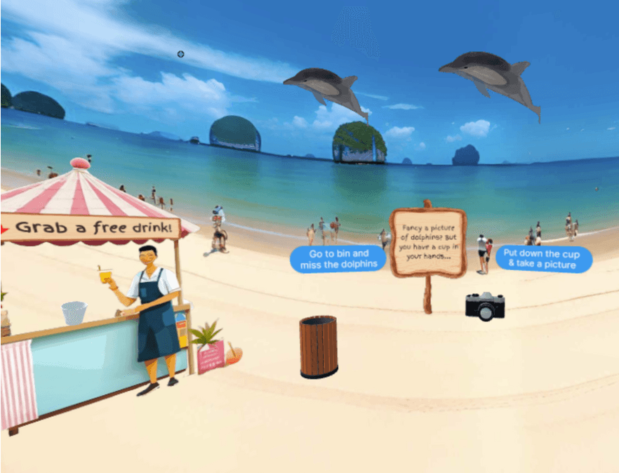
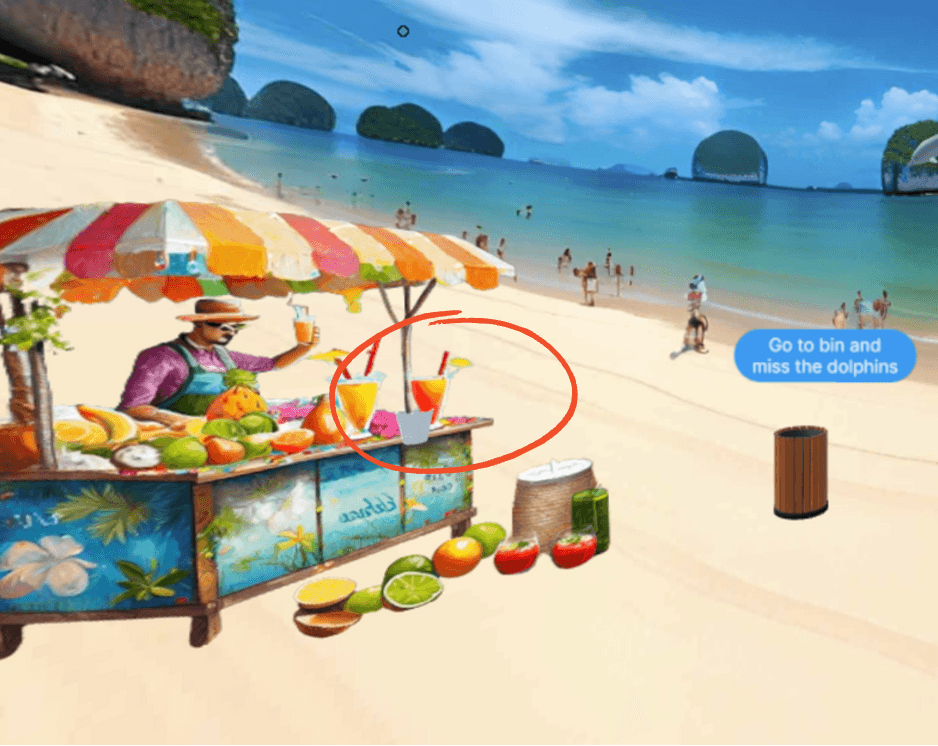
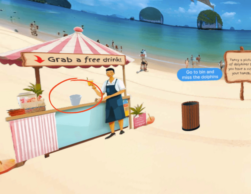
There were some "ambiguous objects." Users found it hard to identify certain objects. To rectify this issue,, we improved visibility, by making objects like the cup in the vendor scene more salient. Also, we replaced a realistic tourist with an animated one to ensure consistency, presence, and attention.
"The cup looked like 2D, I think if it was maybe tilted, it might have stood out." - P2
"Where do I grab the drink?" - P1
" I saw that she was picking something up. It wasn’t clear to me what the lady was doing" - P1
Before
After
Theories:
Scenes:
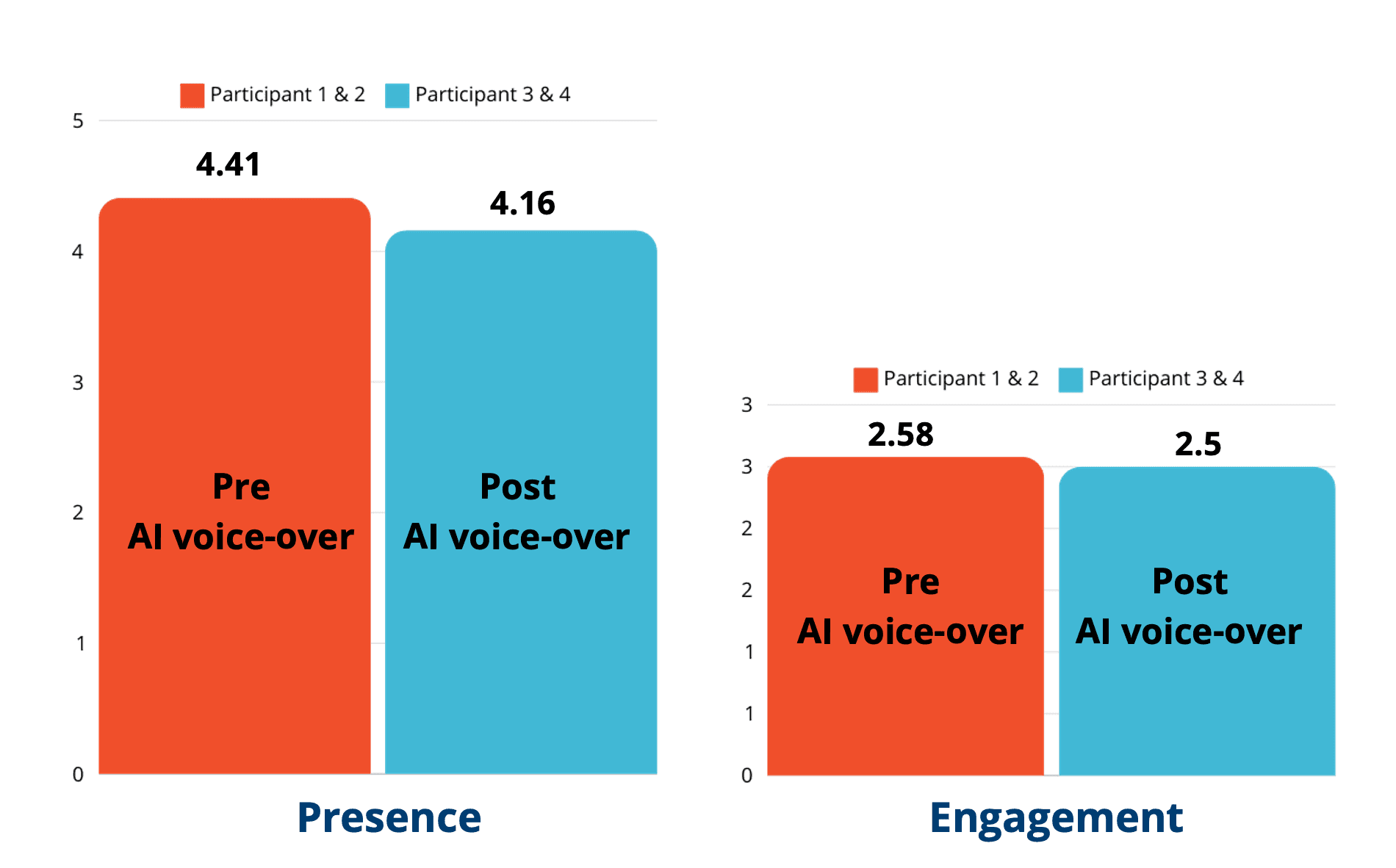
Testing Results for Presence
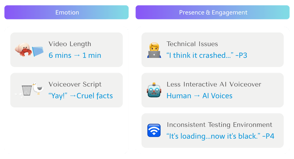
We tested 4 participants in total and analysed them by grouping them into 2 based on our testing method. For the red group, we voiced over the characters in the story, and for the blue one, we used pre-recorded generative AI instead. The results show that both the level of presence and engagement decreased after using AI voice-over.
The average presence and engagement were identified for 2 participant groups.
Results for Emotion Response
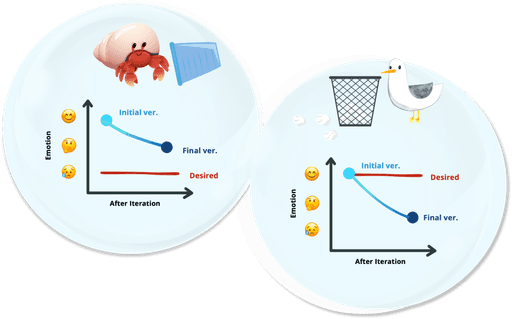
We selected two scenes that we consider important for behavioural change.
In the scene that shows the impact of plastic on hermit crabs, after design iterations, the average decreased from positivity to negative, closer to the desired 'negative' emotion we aimed for.
On the other hand, in the scene where the user helps pick up litter, there is a shift from happy to negative emotion although our desired emotion was a 'positive' emotion.

Reflection
Results Analysis
In analysing the causes of the results, we found success in the final scene of the hermit crab storyline, where we shortened the video to maintain user attention effectively. However, in the other scene, despite our intention to evoke feelings of happiness and pride, we unintentionally used words like 'choke' and 'die' while conveying certain facts, potentially leading to a negative impact on the users’ emotions.
Next Steps...
For the next steps, we need further testing and iteration to validate the efficiency and effectiveness of our prototype.
➊
How can we strengthen the bond between Tao and the user?
➋
Will the different genders of participants affect the experience?
➌
Lack of engagement due to the AI voice or lack of real-time response? or both?
Ethical Considerations
We identified several ethical issues and risks, and provided mitigations during the design process. These included technical concerns such as screen crushing and upside-down orientation, which could potentially induce motion sickness in users. Additionally, we acknowledged the risk that if we don't regularly update the information, it may become outdated in the future.
Risks
🦺 Safety Concern
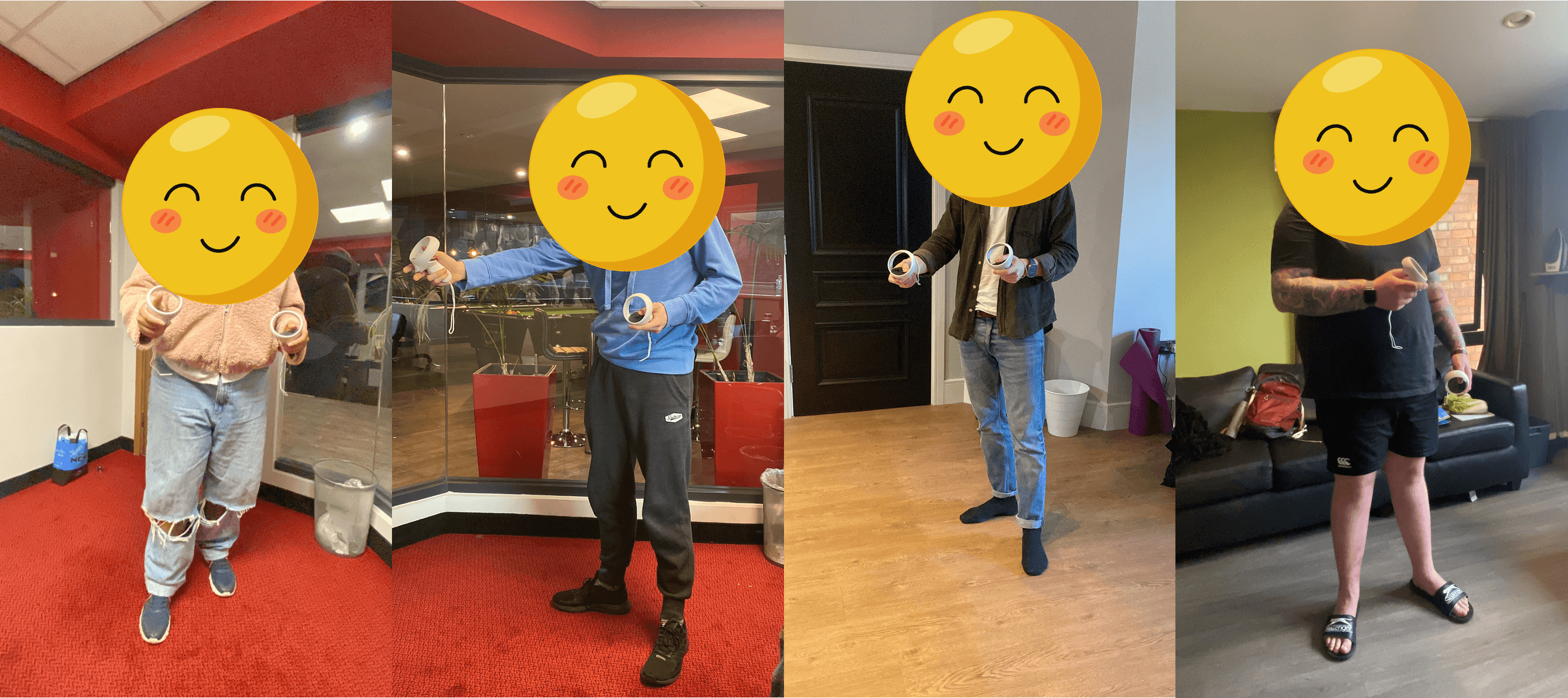
As the testing locations differ, the participants might hit the surroundings while immersed in VR.
⏱️ Outdated Information
The presented information is not the latest data (outdated), it might be misleading.
🚩 Technical Issues
When leaving the “hermit crab consequence video room”, the screen went dark or started flickering, which caused motion sickness.
🥱 De-sensitisation
The “hermit crab consequence video” shows negative impacts on marine life, and it might cause people's mental well-being and de-sensitisation.
* It did not happen in our testing.
Mitigations
⚠️ Disclaimer
The VR experience disclaimer is placed on the first scene in the lobby.
🥰 Happy Ending with Happy Feelings
“When I saw the video of hermit crabs, and they definitely portrayed that humanity's terrible. But it was nice to see other people picking up rubbish.” - P2
“So you ended up with more of a positive feeling.” - P2
